Parkinson's Progression Markers Initiative
Making life saving data and research more accessible

The Michael J. Fox Foundation collaborates with USC to maintain one of the world's largest Parkinson's data repositories. Their PPMI website provides open-source access to researchers seeking data and biospecimens for Parkinson's research.
I was tasked with revamping the decade-old website in 6 months. While stakeholders initially wanted only visual updates, my evaluation revealed deeper usability and content issues that needed addressing. The project also required making the site responsive and migrating to a modern, secure CMS.
Client: Michael J. Fox Foundation, under the employment of USC's Laboratory of Neuro Imaging
Roles: UX Design, UX Research, Visual Design, Content Strategy, Development
Audit & Evaluation
I began by auditing the current site, inventorying all pages and content in a shared spreadsheet. I evaluated key pages to identify gaps and opportunities, then presented findings and recommendations to stakeholders to establish project goals.
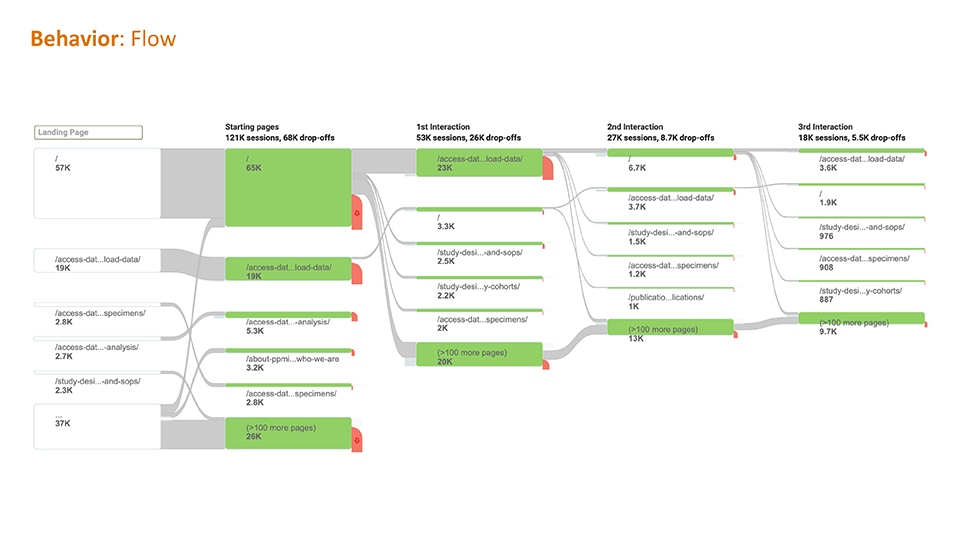
Analytics & flows
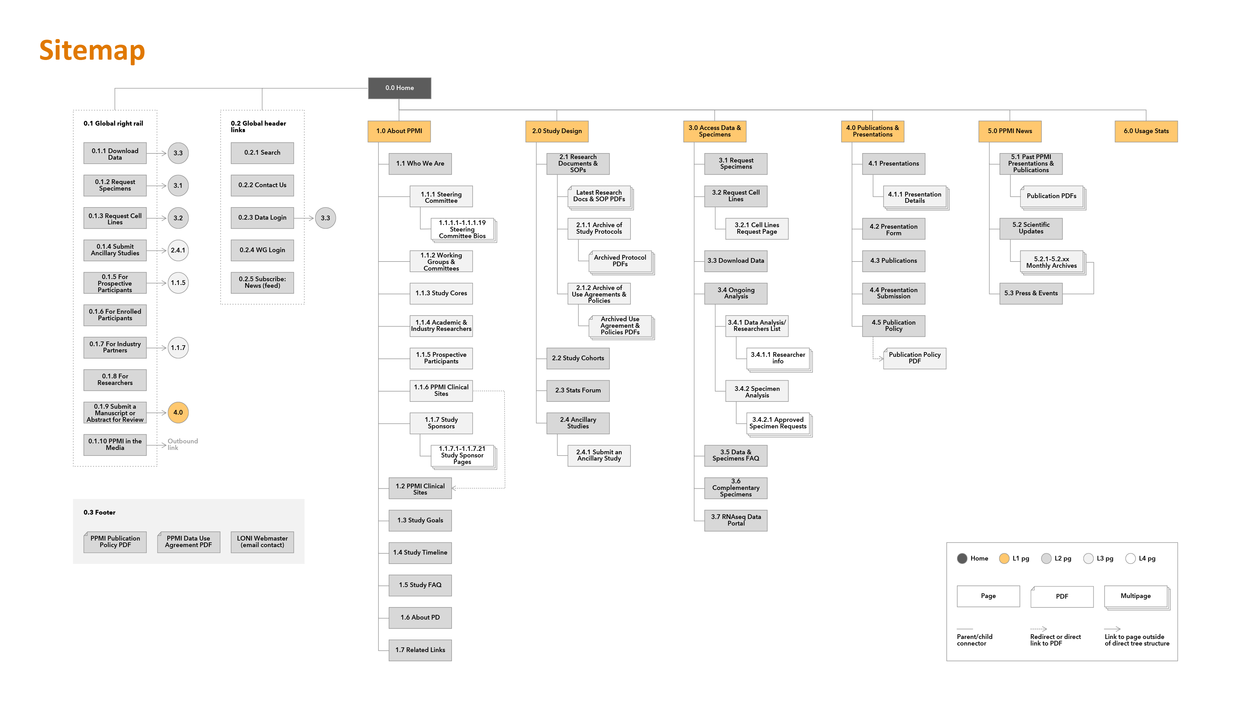
Information architecture review
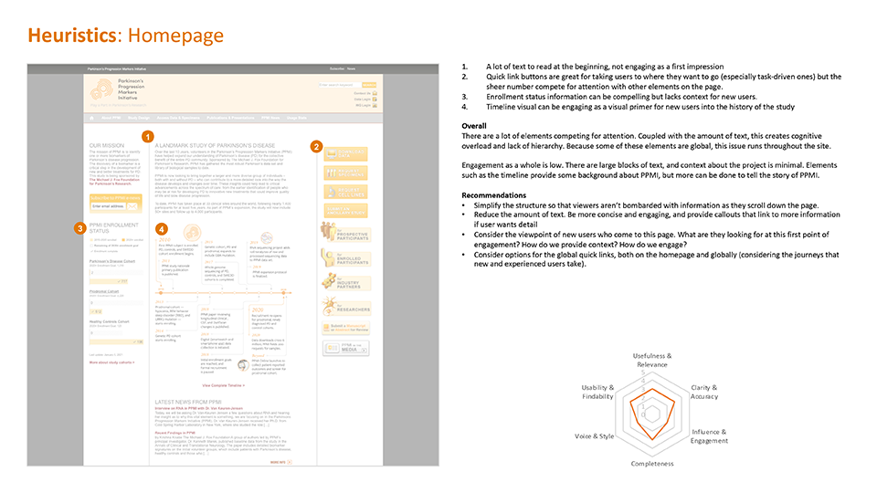
Heuristic evaluation
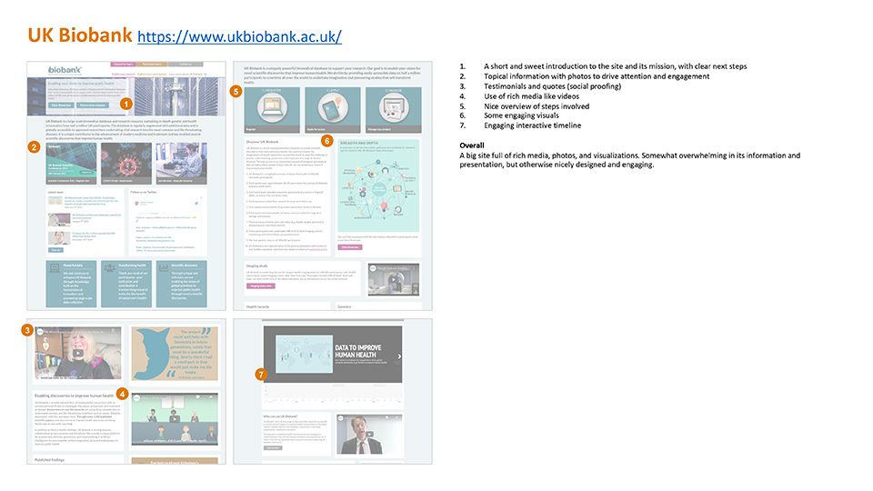
Competitive review
Content evaluation
Evaluations included:
- Analytics & flows: Analytics confirmed visitors primarily accessed data pages with ease. I needed to maintain this while driving traffic to underutilized pages.
- Information architecture: I mapped the site hierarchy and found confusing taxonomies and nomenclature that required restructuring. Pages were assigned IDs for organization.
- Heuristic evaluation: Key pages scored low on usability, findability, and content engagement across 10 heuristics.
- Competitive review: I analyzed similar sites to identify best practices and potential features to incorporate.
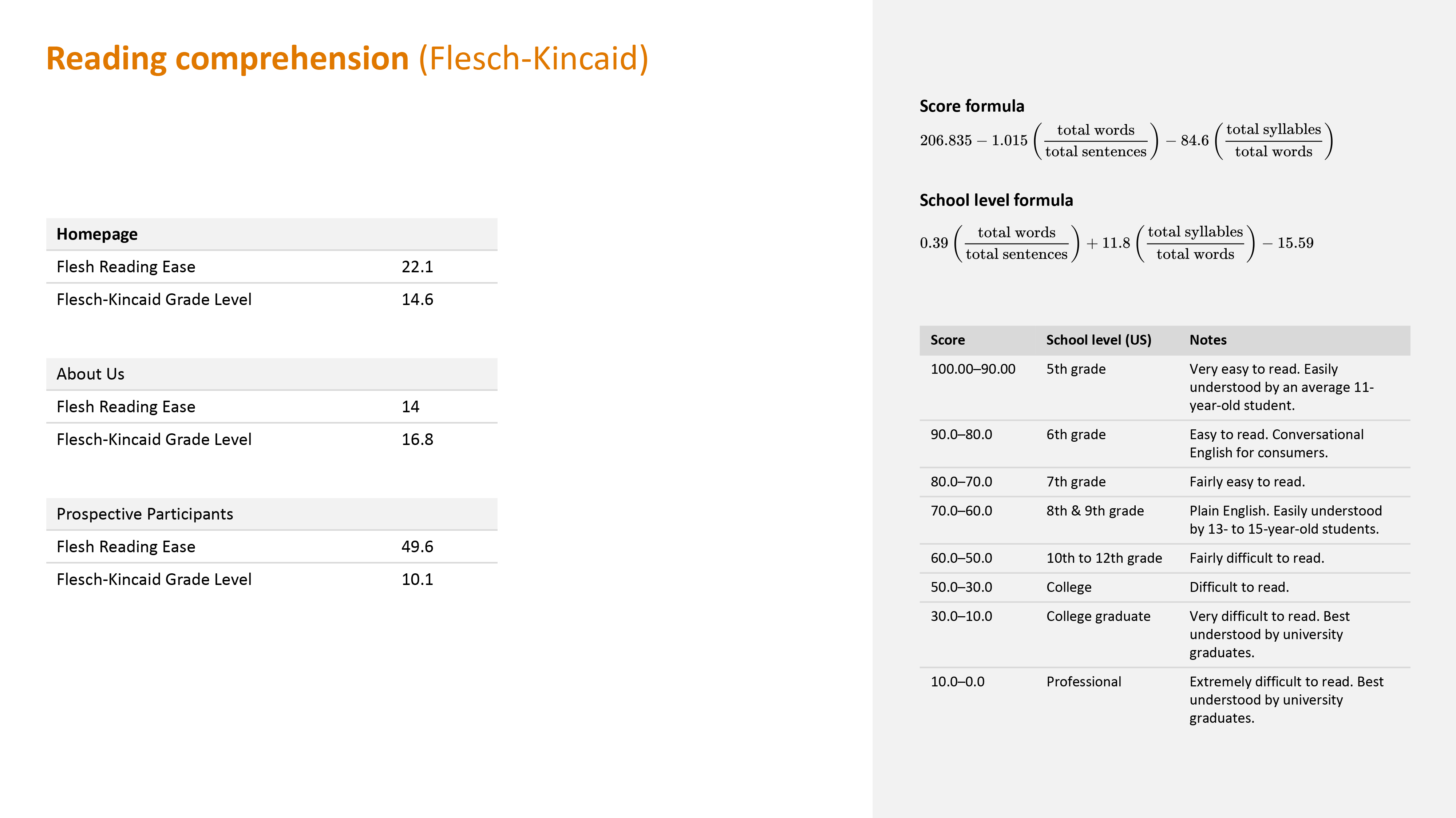
- Content evaluation: Flesch-Kincaid analysis revealed that public-facing pages like the homepage and "About" page were very difficult to read, despite needing to engage broader audiences beyond academics.
User Interviews


I conducted remote video interviews with Principal Investigators (PIs), the lead researchers who are core site users, to understand their pain points and work processes.
Key insights:
- PIs typically work with grad students or data scientists who handle the technical data work
- Users struggled to parse data and lacked insight into its nature before downloading
- Beyond data access, PIs wanted to see how others used the data to avoid duplication and spark new ideas
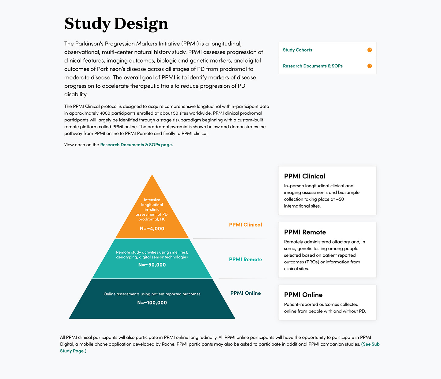
- Understanding study cohorts was essential but this information was buried on the site
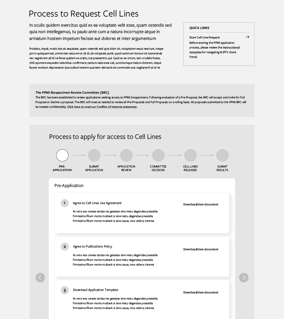
- The biospecimen request process was unclear despite detailed instructions
Problem Statements
With the evaluations and user interviews done, I gathered all the key insights to hone in on a few problem statements:
- How might we allow users to more easily find the information they need?
- How might we center the site around helping users understand the data?
- How might we make the process for requesting specimens more clear?
Content Strategy
Though user experience and visual design was deemed as highest priority by stakeholders, through my evaluation I knew that content needed to be revamped in order to accomplish our goals.
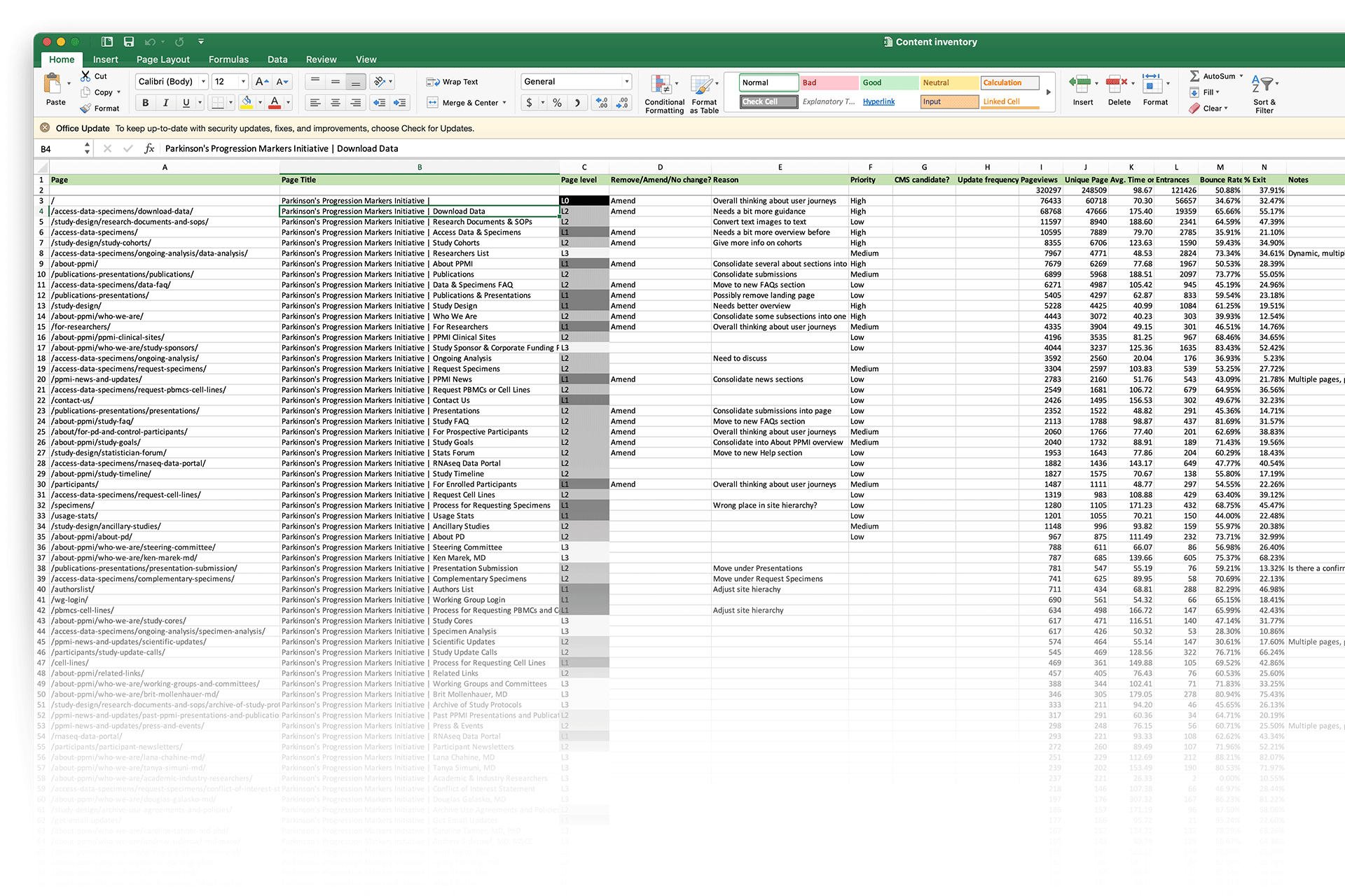
Content Inventory
I took the content inventory from the audit and used it as a shared, high level way to document progress and set goals and priorities, using analytics, page hierarchy, and content quality as a guide.
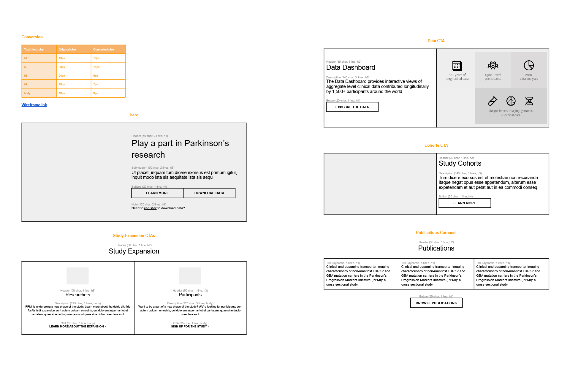
Content templates
I collaborated with writers to create reusable content patterns and templates with guidelines like character counts, shared via Google docs. These templates informed the wireframes.
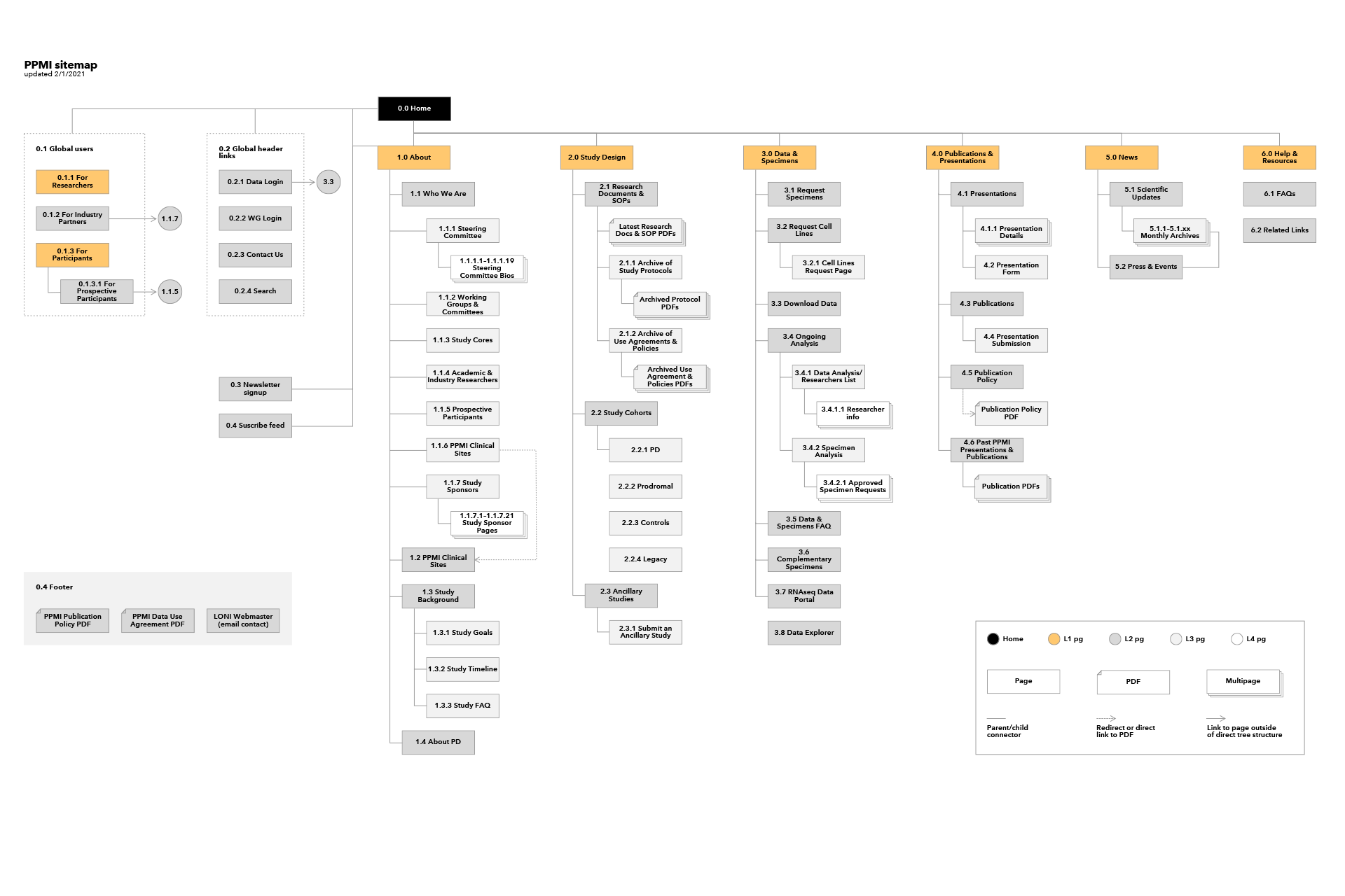
Information architecture
I ran co-creation sessions with stakeholders to reorganize the site, adjust nomenclature, and rework global navigation for better wayfinding.
Wireframes
I created wireframes based on the evaluation and content work to visualize solutions to our problem statements, then validated these designs with stakeholders.
Prototyping & User Testing
Prototype
I created high-fidelity designs and built an interactive Bootstrap prototype for user testing. Using Bootstrap allowed us to import the designs directly as a Drupal theme.
User Testing
I tested the prototype with users across various archetypes (data scientists, PhD candidates, professors, PIs, PPMI committee members) with different levels of site familiarity. Users interacted freely with the prototype while providing feedback, and completed tree tasks to validate the site taxonomy and navigation.
Feedback
I synthesized user feedback into a stakeholder readout with actionable recommendations, which informed another iteration before creating final designs.
Final Designs
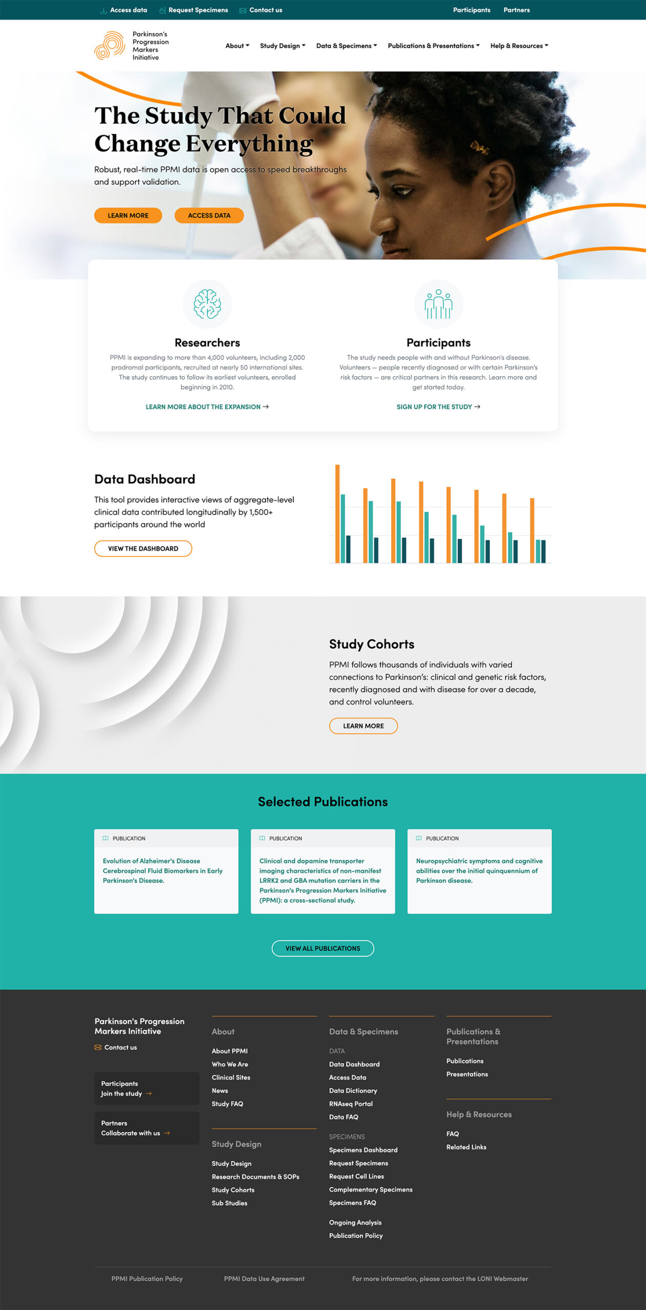
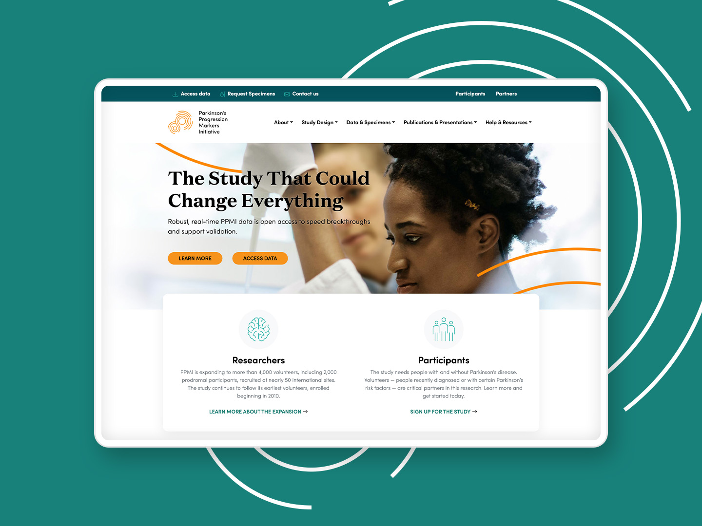
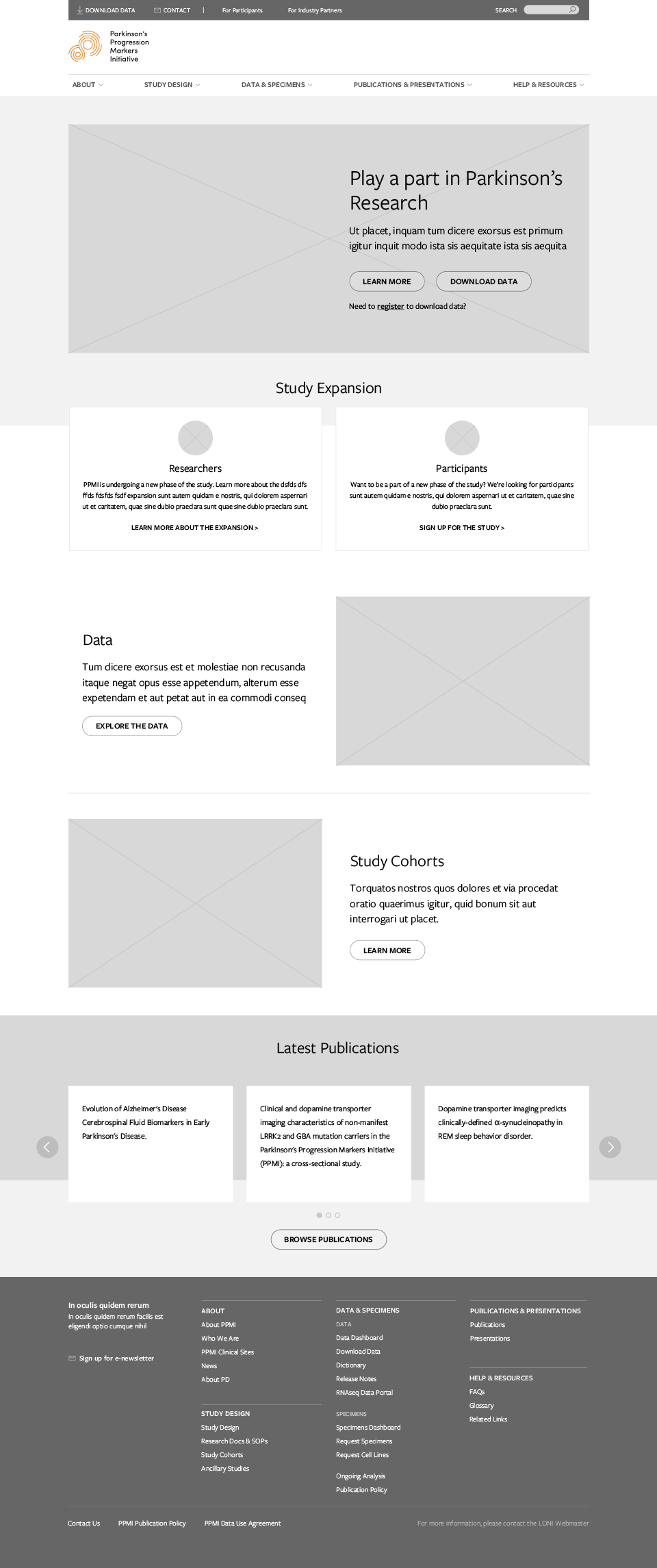
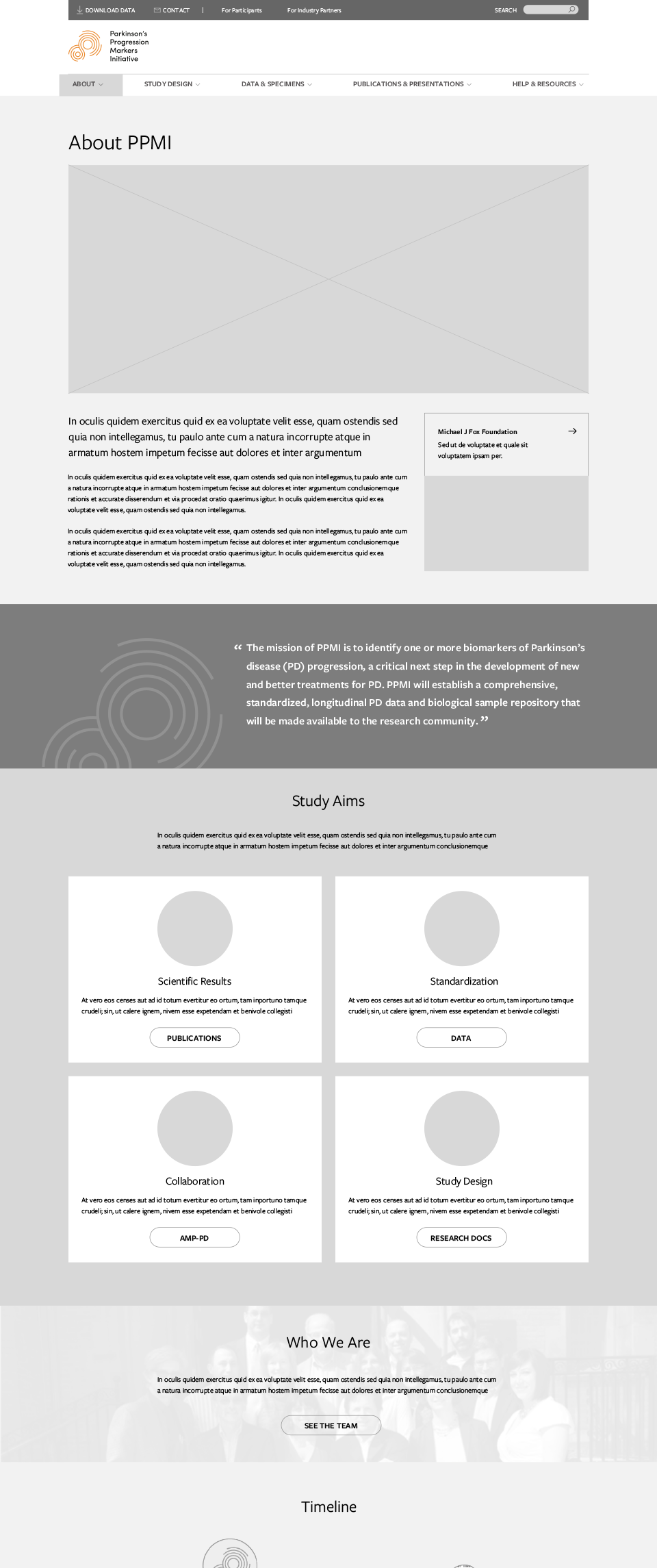
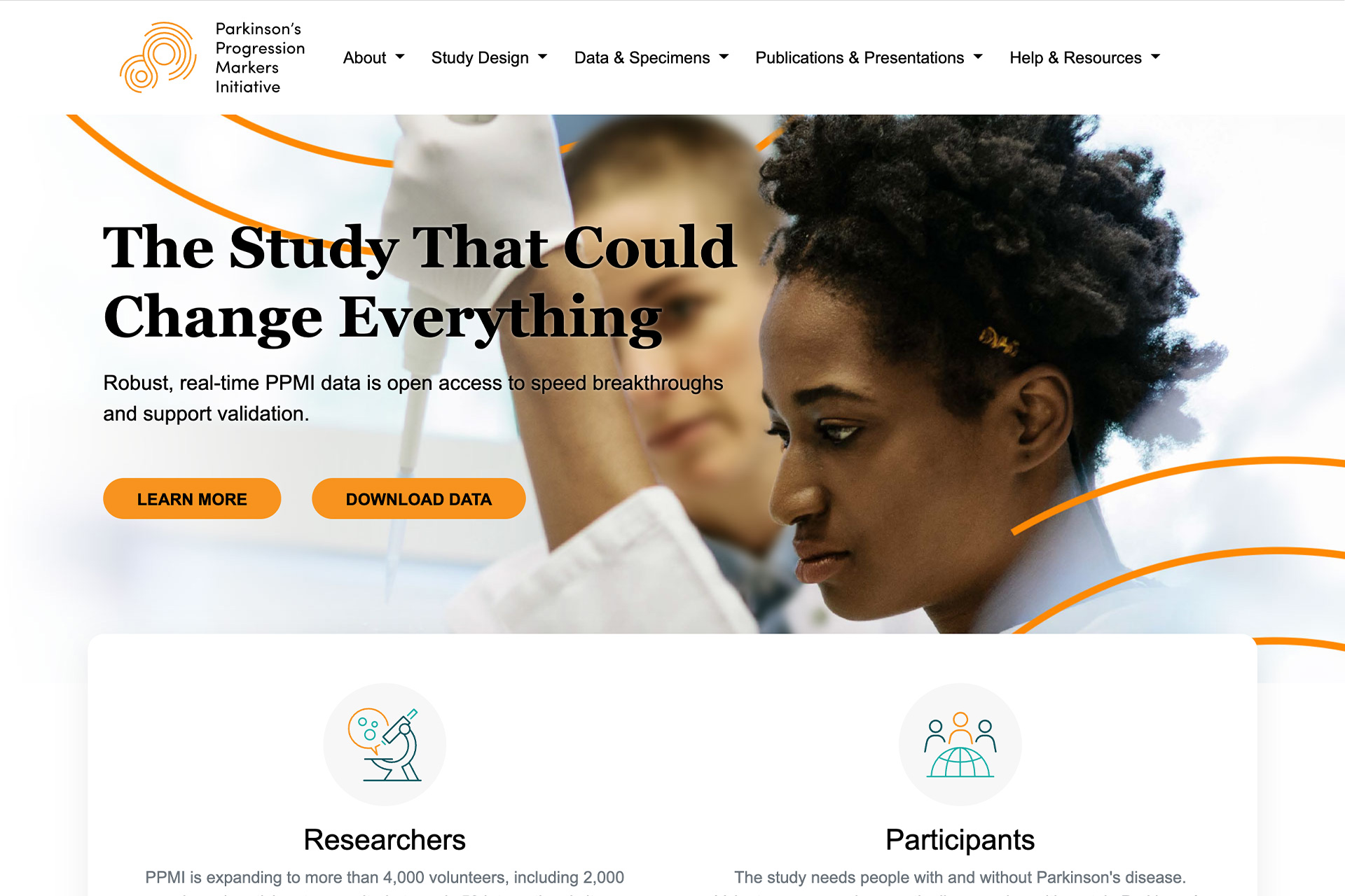
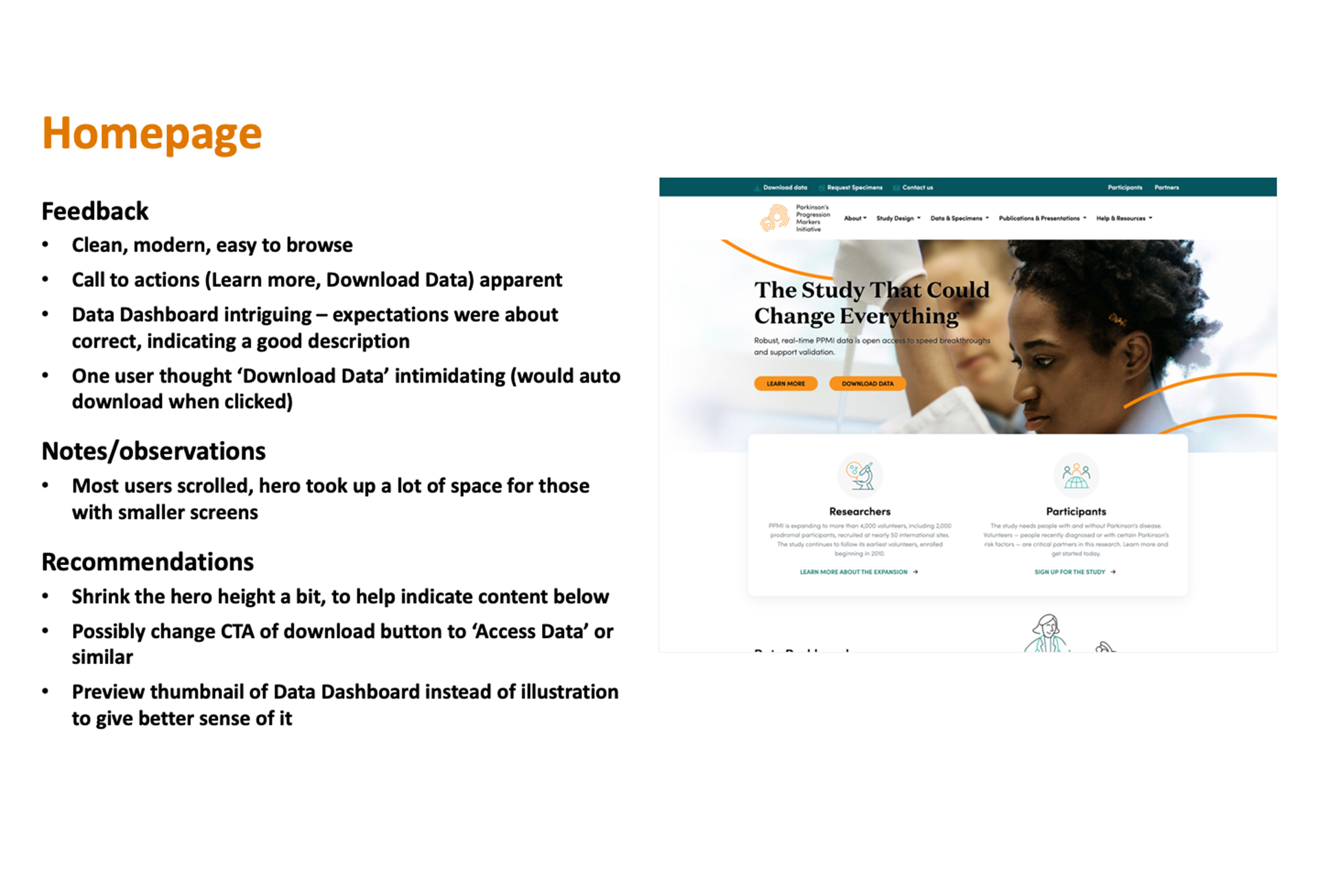
- The homepage was decluttered with shorter, more engaging copy and prominent callouts to key sections. Globally, I cleaned up the main navigation and added a mega footer for better wayfinding.
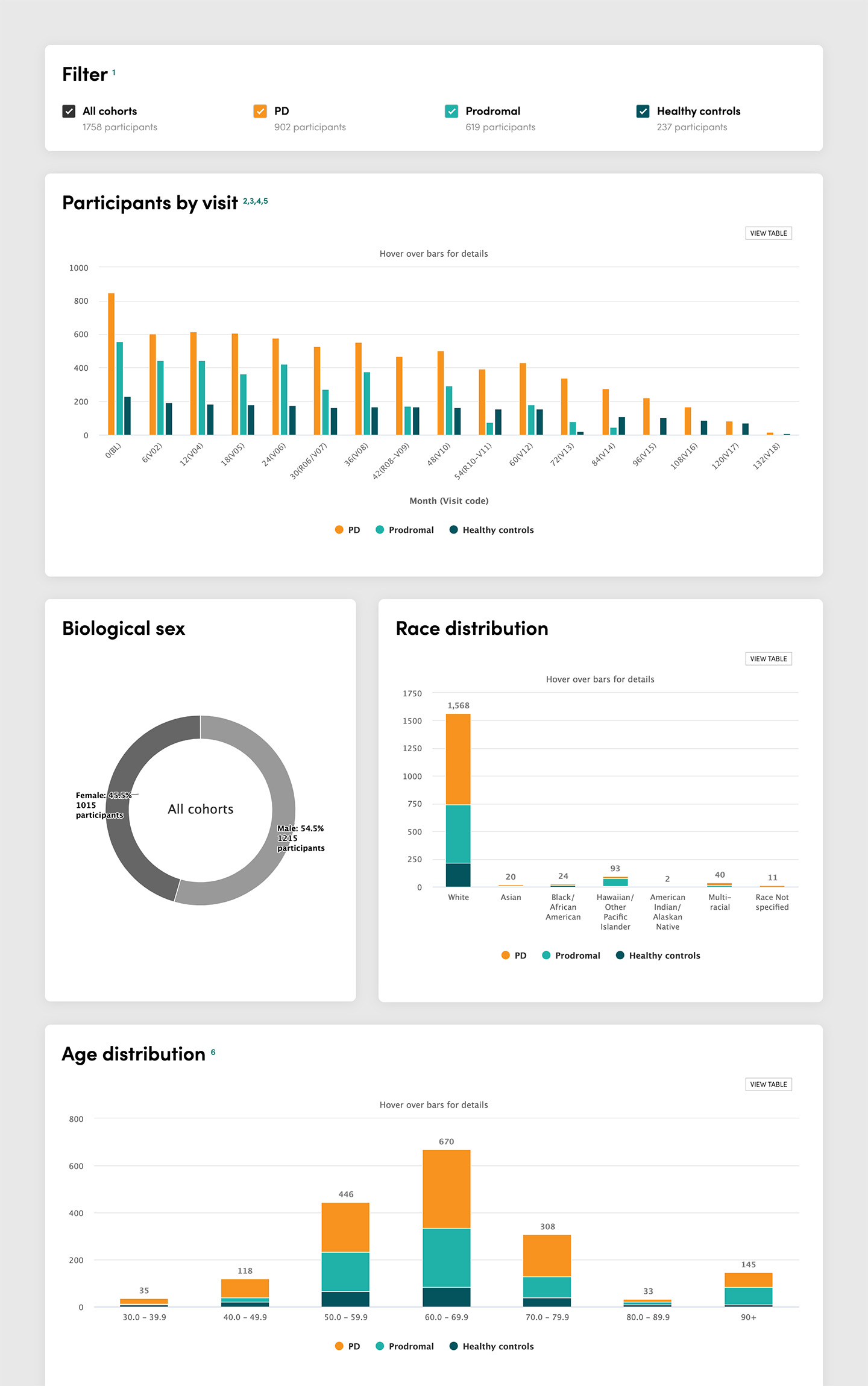
- I created a data dashboard using HighCharts and SQL queries to help new users understand the data through basic statistics before applying for usage.
- Cohort information was enhanced with more relevant details, and global content modules like resources were added to improve wayfinding.
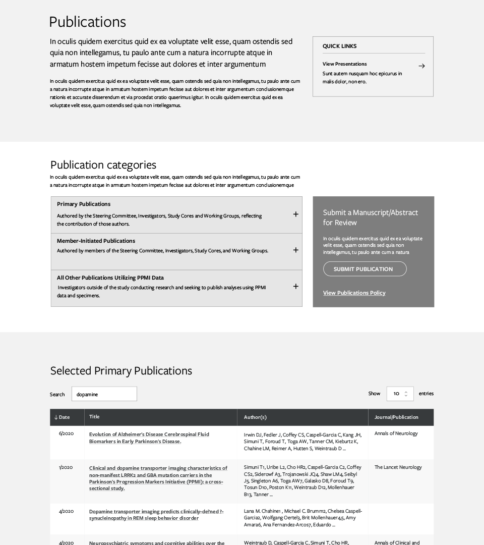
- Publications were redesigned from one long list to include robust search functionality and pagination for better results management.
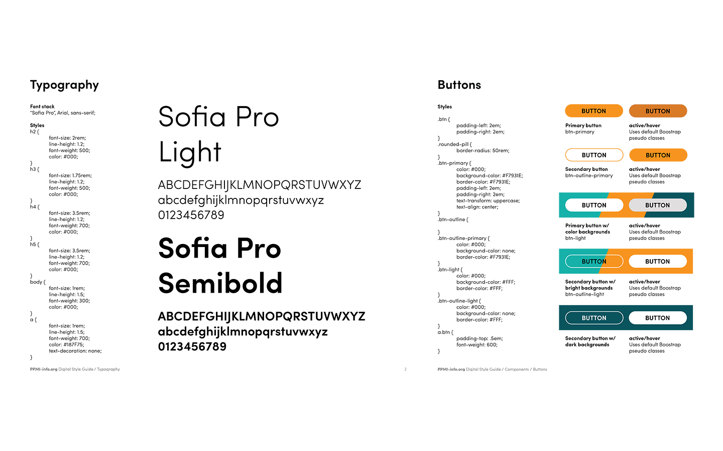
- I created design system documentation covering branding, design tokens, and patterns to aid future maintenance and governance.
Outcomes
The website launched successfully in time for the expanded phase 2 study, receiving positive community response and reaching a significantly larger audience.

Improved usability & wayfinding
Site structure and navigation were simplified through co-creation and user testing, with improved wayfinding via quick links and resource modules.

Clearer content & guidance
Despite the scientific content, language was simplified and condensed to improve comprehension and scannability.

Modernized, responsive design
The redesign incorporated the brand's bright colors and elegant typefaces in a clean, modern, responsive, and accessible design.