CG Global Design System
Unifying design and engineering through art and science
Capital Group's design system was built with atomic principles in mind, and had a robust set of components. Yet there were many glaring issues. Accessibility had not been a priority, so there was color contrast issues and components weren't coded with best practices. Component updates were difficult and hard to maintain, and design and engineering were often talking about the system in different ways that caused confusion.
I lead the design and strategy to modernize the design system so that we could meet AA WCAG compliance, create more consistency and improve maintenance, as well as introduce a foundation based on design tokens.
Client: Capital Group
Roles: UX Design, Visual Design, Systems Design, Taxonomy, Documentation
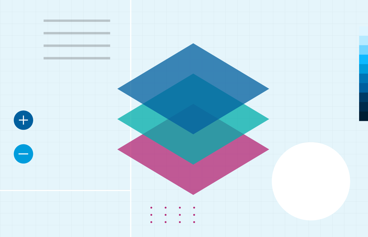
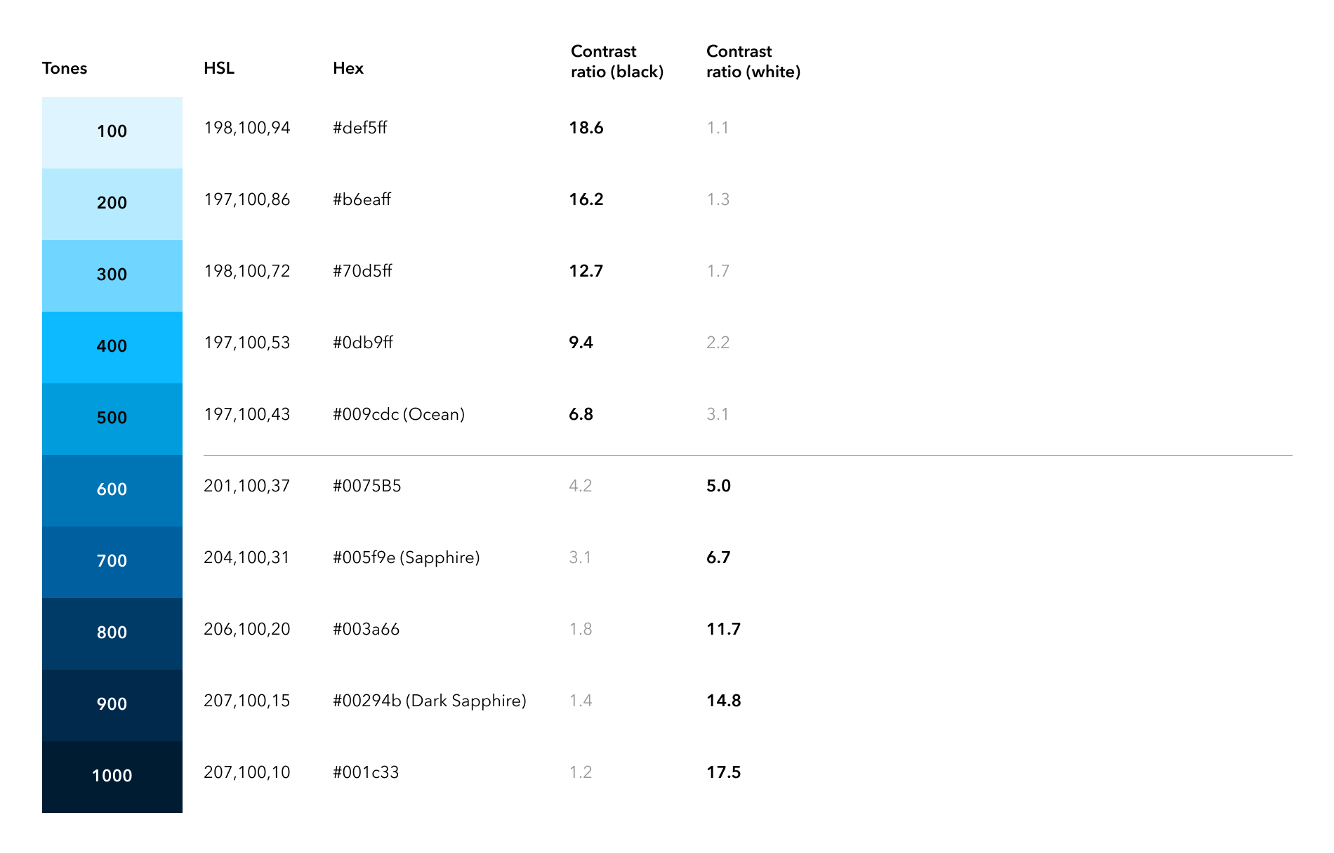
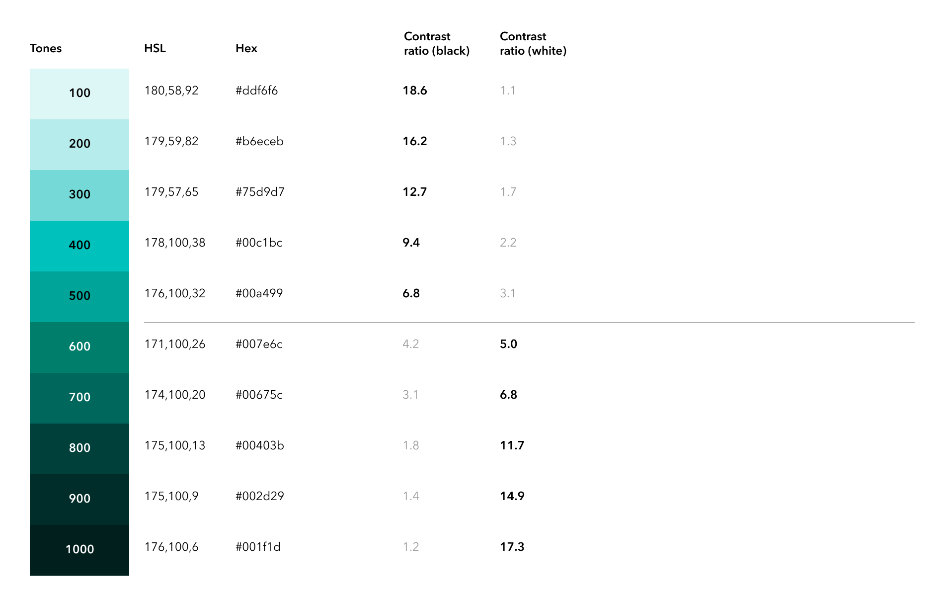
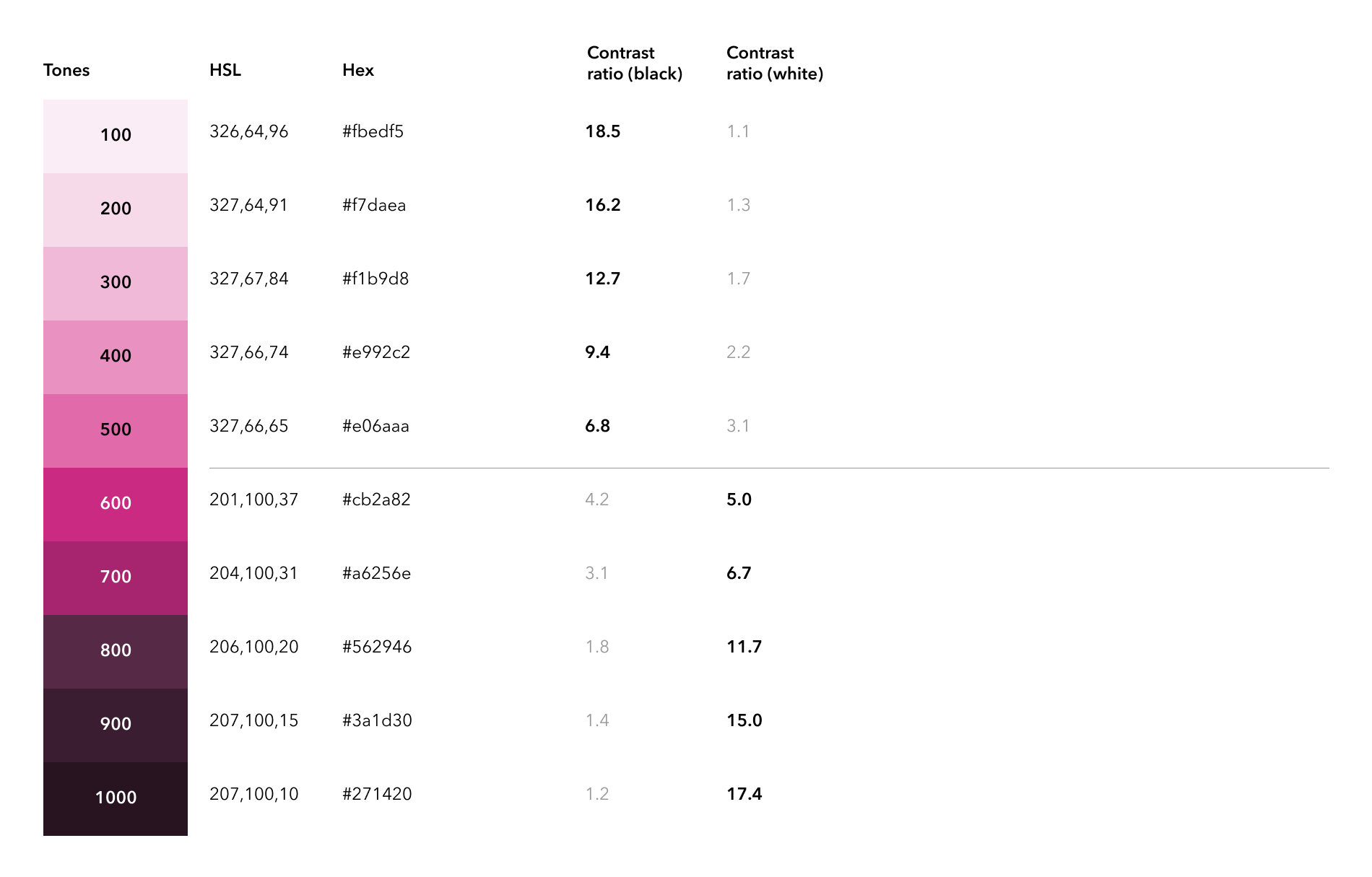
Color
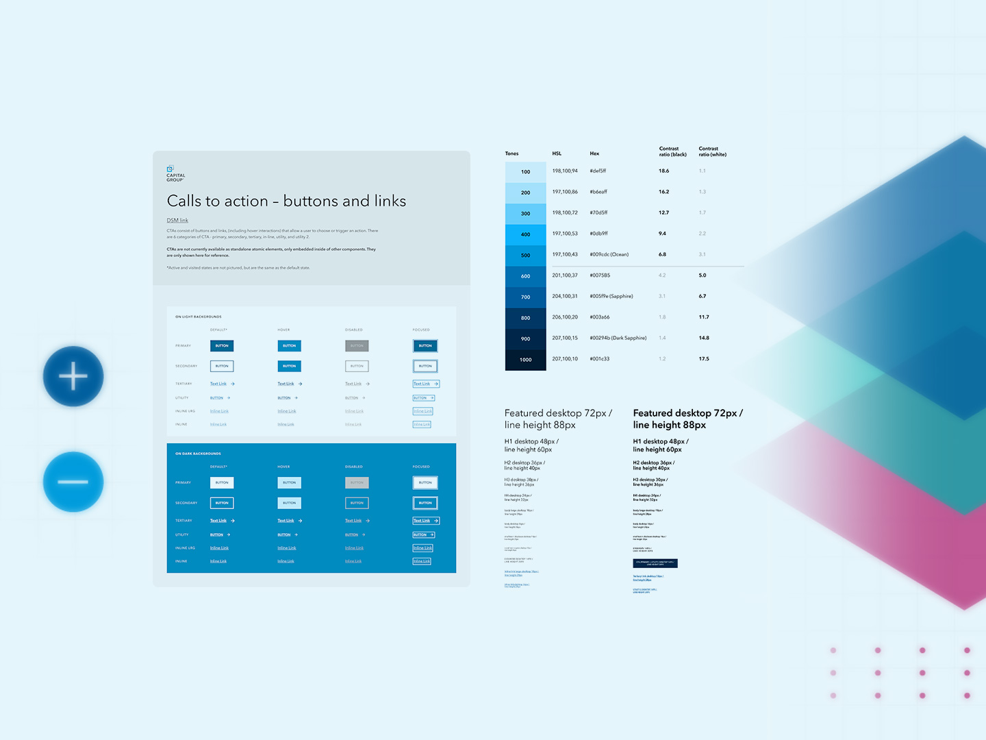
To achieve accessibility, I had to ensure that our brand colors had enough contrast when combined with text, images, and graphics. I knew the palette needed to be expanded to provide the flexibility we needed. But using standard ways of generating color ramps resulted in colors that had a different contrast when compared across the same values. The breakthrough came in the form of Leonardo Color, an open source project from Adobe that allowed us to generate color ramps that had exactly the same contrast across values. Thus it simplified the rules for combining colors and made it predictable.
Typography
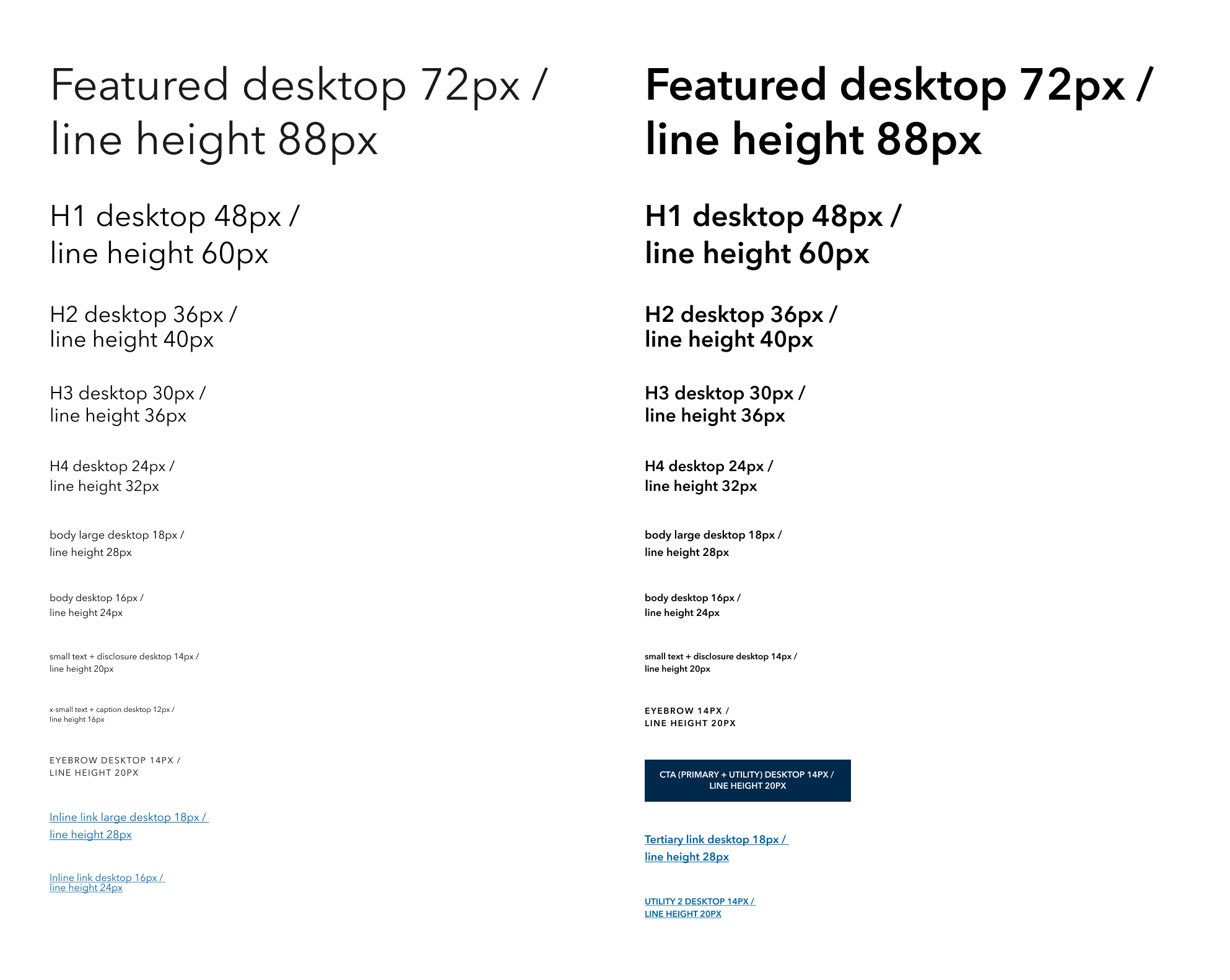
The type ramp from the original design system didn't have any rhyme or reason as to font sizing and line-heights; most seemed arbitrarily chosen. I revamped the type ramp to be on a base-8 system, where type sizes and line-heights where divisible by 8 or a half-step of 4. This ensured a consistent visual rhythm and harmony across the typography. This also allowed the system to easily scale as needed.
Spacers
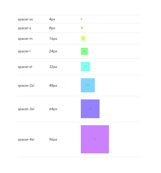
Spacers were also simplified and redone on a base-8 system to retain the same visual rhythm and harmony of the typography, and implemented across both vertical and horizontal spacing, reducing design fatigue when trying to properly space and align objects.
Design Tokens
I introduced the concept of design tokens to the team, which would act as a shared language and translation layer between design and engineering, and more importantly, improve on component maintenance and enable powerful capabilities such as theming.
Tokens were created in three tiers:
- Foundational, which are the primitive building blocks (i.e., colors such as blue-100).
- Semantic, which speak to the utility of the token (i.e., surface-color-primary).
- Component, which are component-specific overrides of semantic tokens (i.e., button-surface-color-primary-hover).
Taxonomy
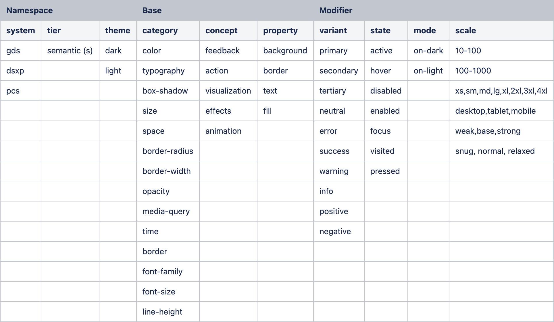
I proposed a taxonomy to help the team agree on a common way to name our design tokens, while retaining some flexibility to be as concise and simple as possible.
Token variables
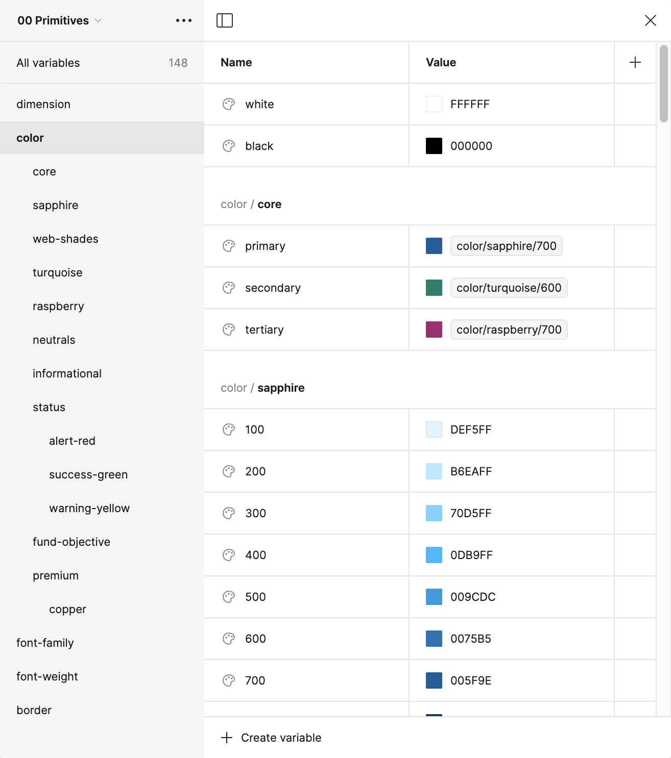
Once token values were established, these were documented in Figma as variables, which allowed us to align our design tools with engineering, and ensure that components were built using the same values as in code.
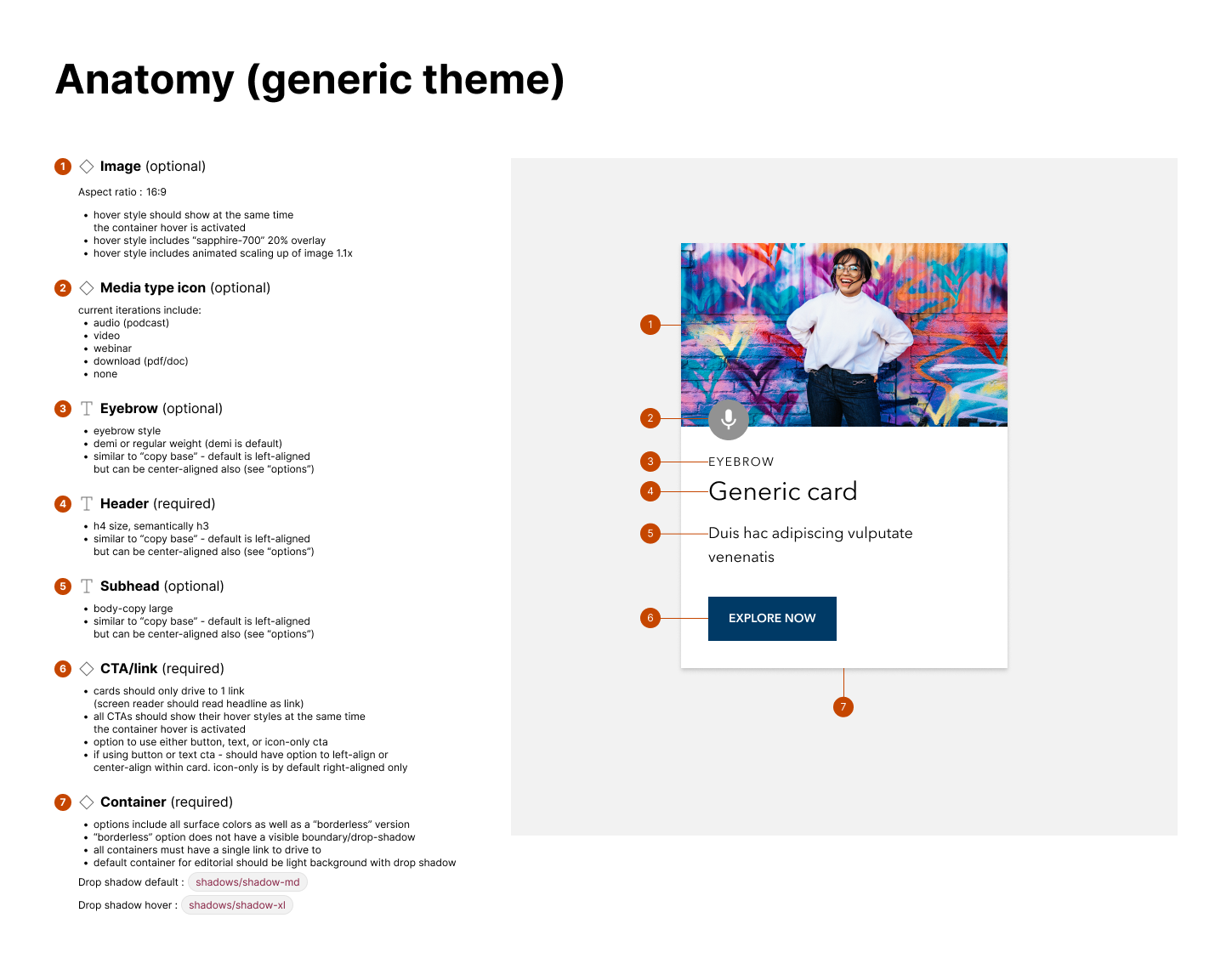
Components
Components encapsulate all the foundational work we've laid out – colors, typography, spacers, design tokens – with a eye towards accessibility, resuability, consistency, and ease of authoring.
Documentation
Design specifications
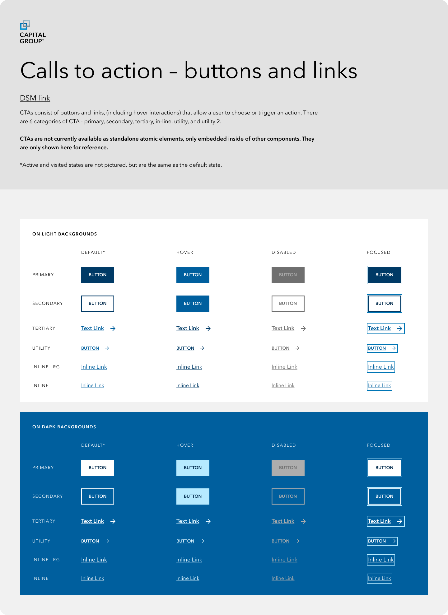
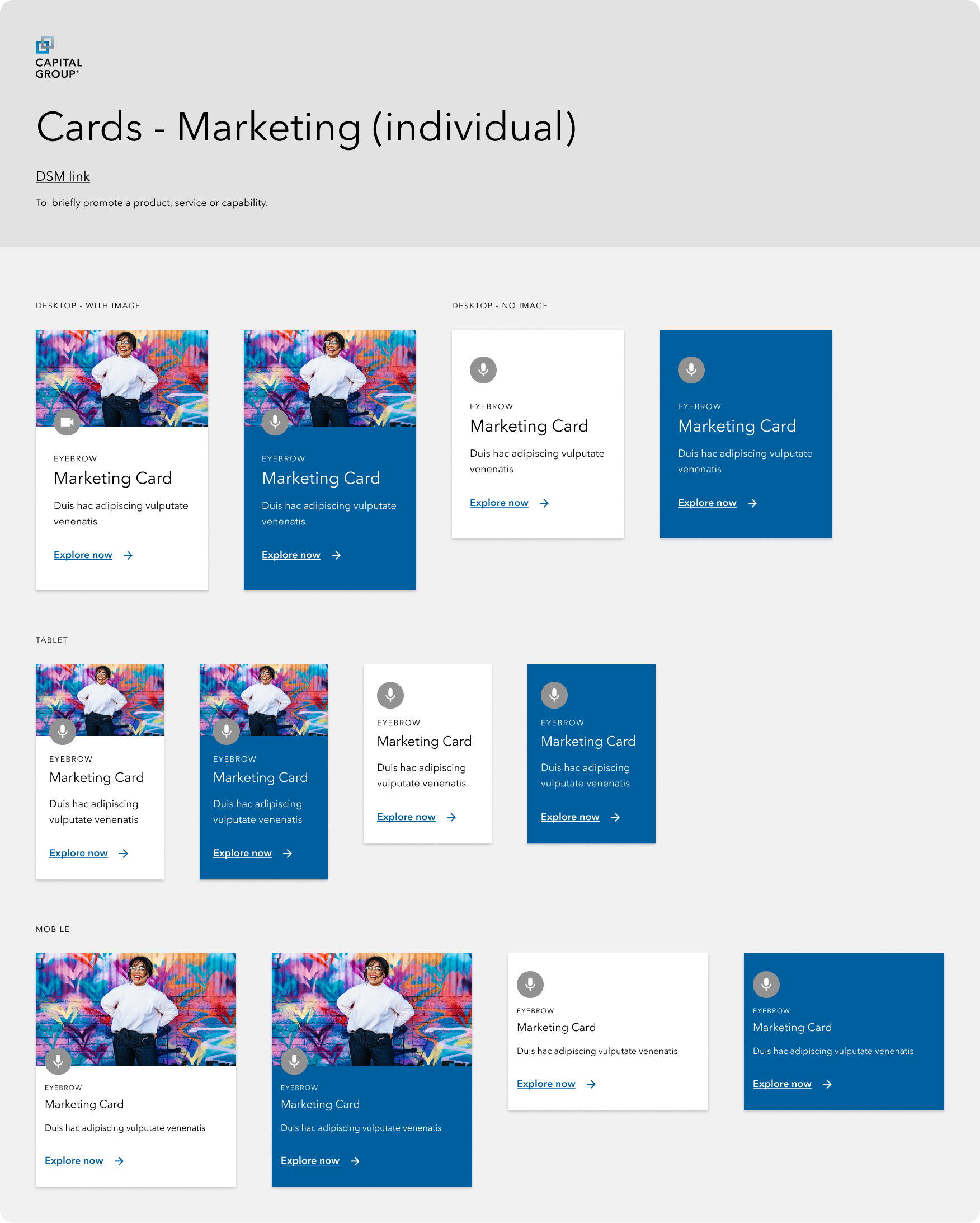
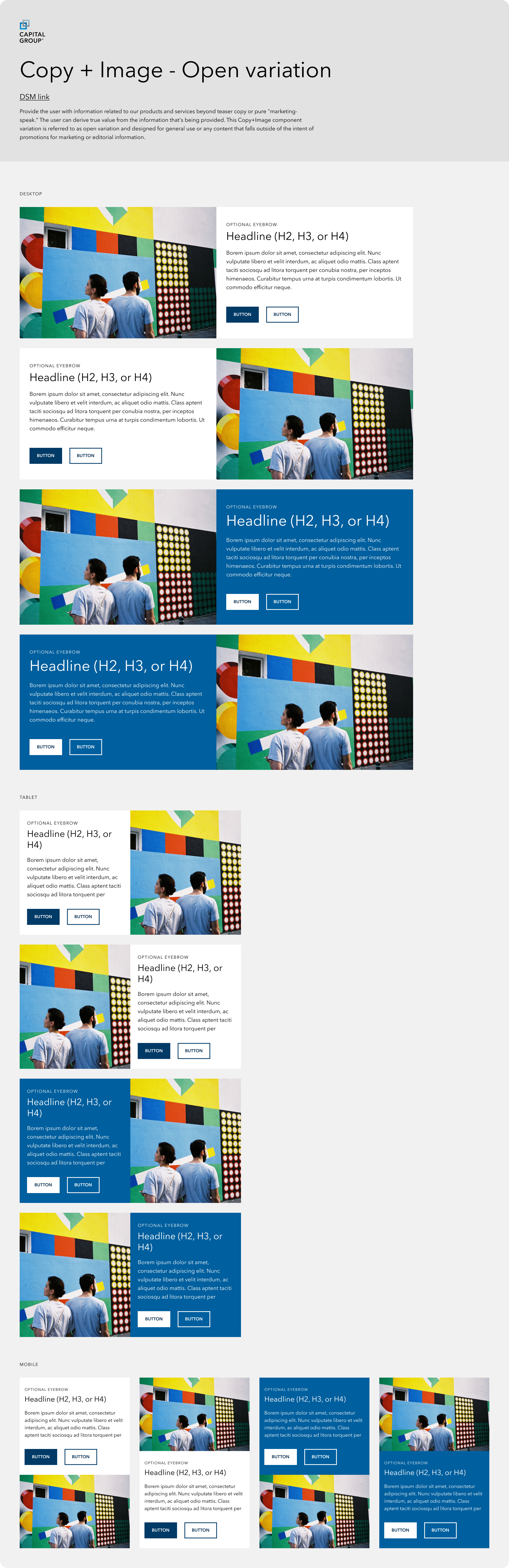
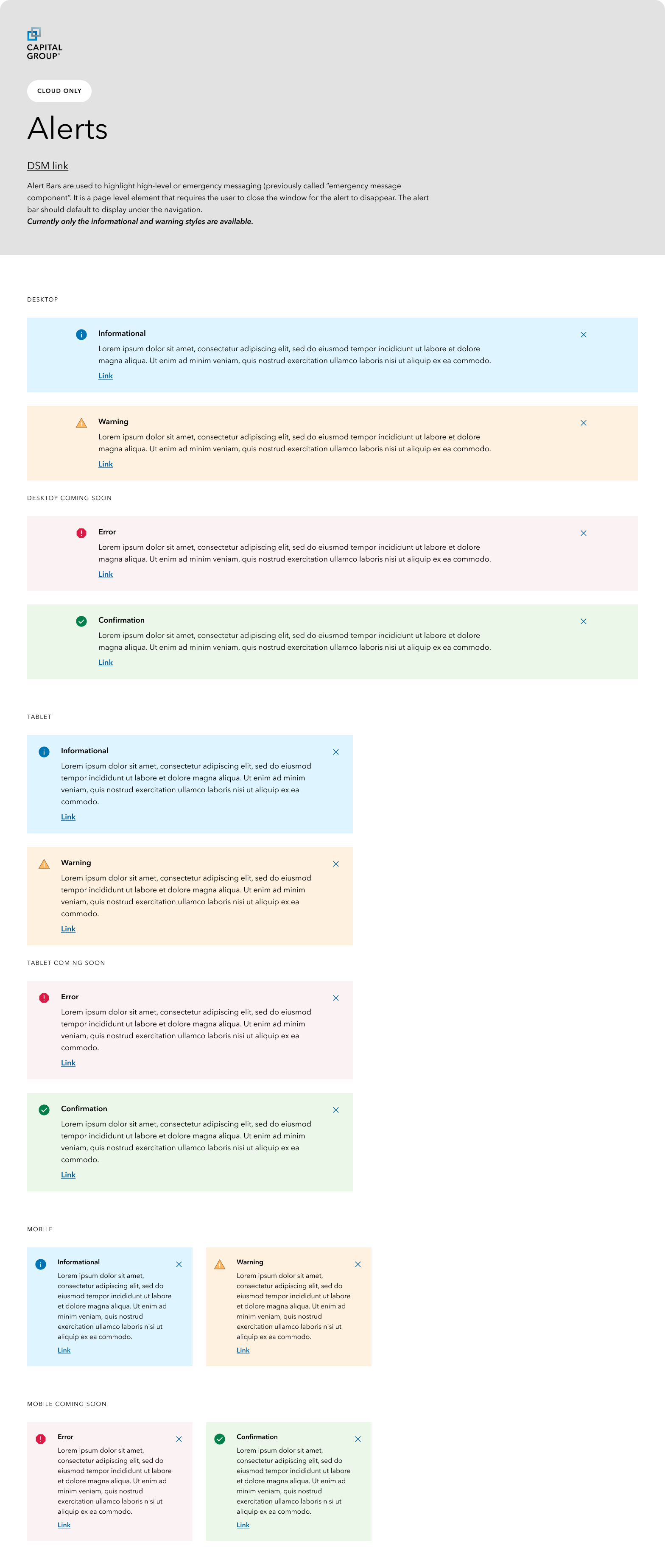
Design specifications used to be something that design just threw over the wall to engineering. I introduced a more robust design spec documentation process, as well as recurring meetings for joint design and engineering discussion for new components.
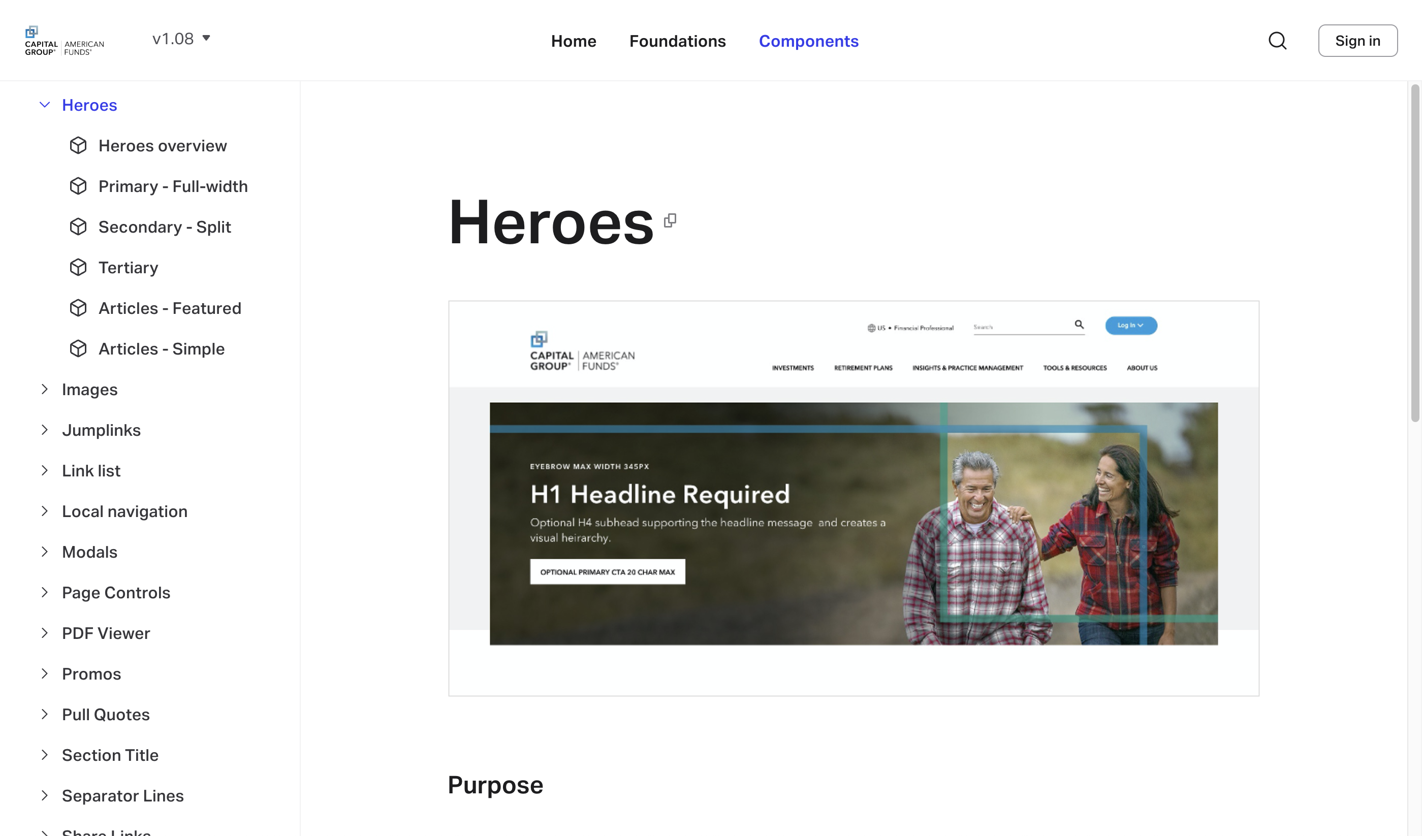
Design System Manager
Using Invision, I maintained the documentation for the design system and components. This documenation became the source of truth not only for designers but also engineering and writers as well.
Outcomes
30%
Increase in site performance
The new component framework created efficiencies that boosted first to paint times, which in turn help improve the user experience.
75%
Reduction in authoring & design
AEM authors were experiencing up to a 75% reduction in the time it took to author a component. Designers experienced a similar result for how long it took to mock up a page.
AA
WCAG compliance
With a focus on accessibility, the design system ensured that foundational elements and components had accessibility built in, so that designers didn't have to do the guess work.
