My Retirement
Meeting people where they are in retirement planning

Getting people to think about retirement and retirement planning is particularly difficult, especially in the form of contributions to their 401(k). Common barriers are fear, lack of knowledge, shame, debt, and just life getting in the way.
Capital Group wanted to approach this problem creatively as a powerful value add in the products we provide for our large institutional sponsors. I lead the creative and UX strategy of the experience. Using quantitative and qualitative research, we created a user-centered approach to provide different journeys based on demographic and psychographic segments.
Client: Capital Group
Roles: UX Strategy, Art Direction, Illustration
Link: https://www.myretirement.com

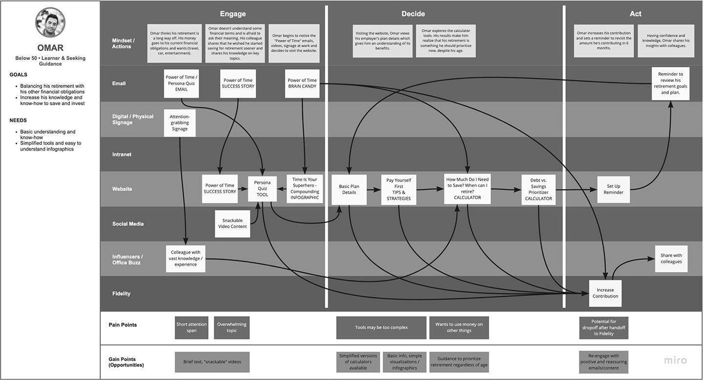
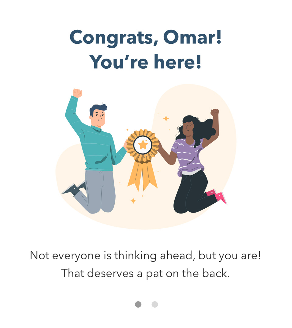
Omar the Avoider

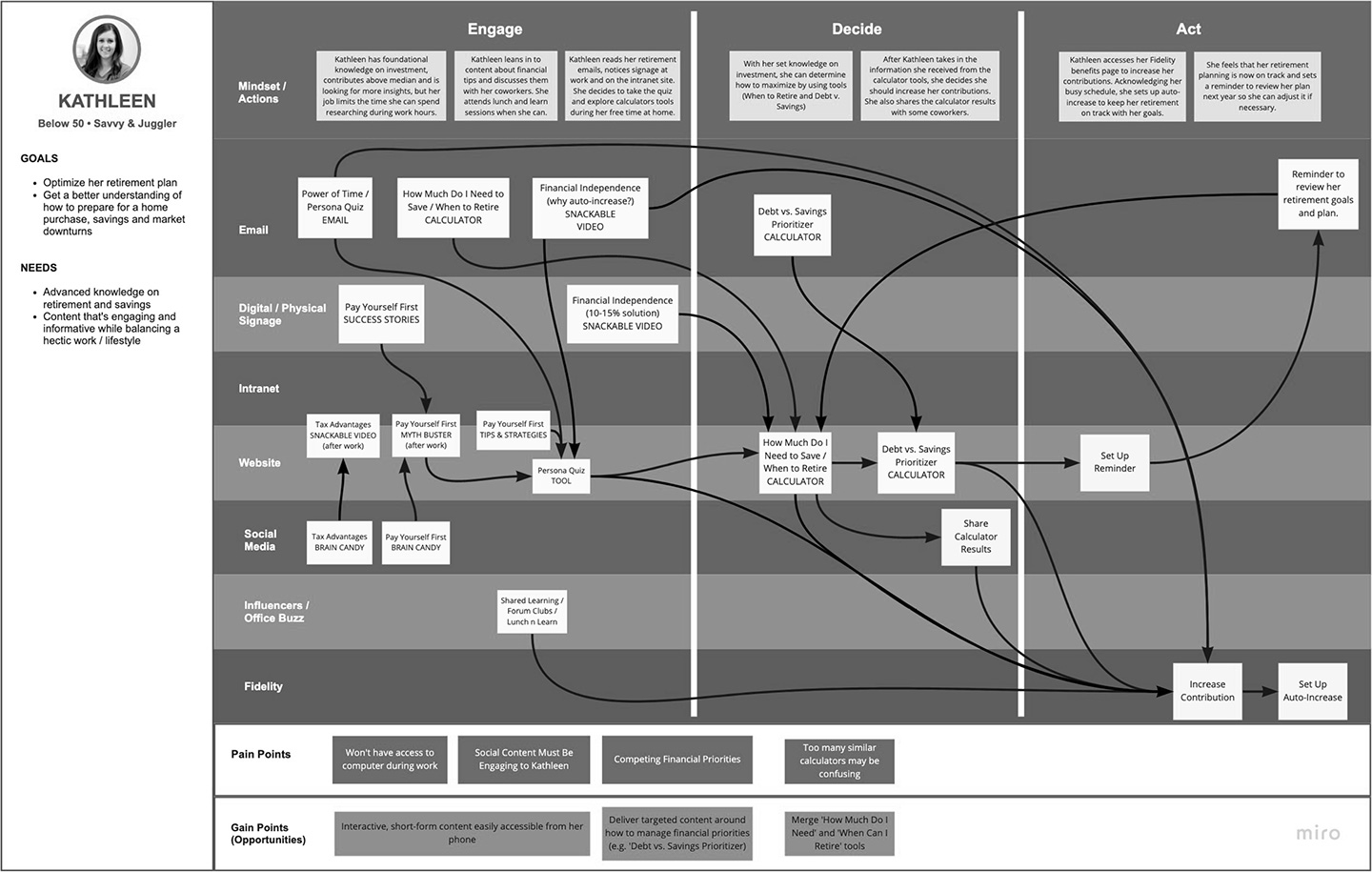
Kathleen the Motivated

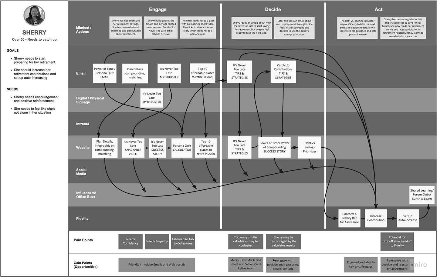
Sherry the Catcher-Upper
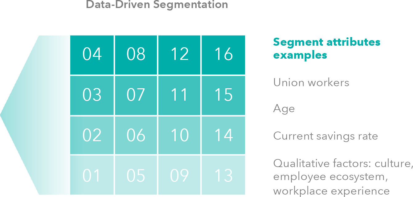
Segmentation & Personas
Retirement programs are often one size fits all. We started with some rigorous research into our client's employees, to derive highly customized segments.
This lead to the creation of our three main personas: The Avoider (young, financially non-savvy), the Motivated (young, financially savvy), and the Catcher-Upper (near retirement, financially non-savvy).
Experience Maps
The personas were used to inform the different journeys we had to keep in mind for our users, to ensure that experiences were personalized and appropriate for their unique needs and attitudes.
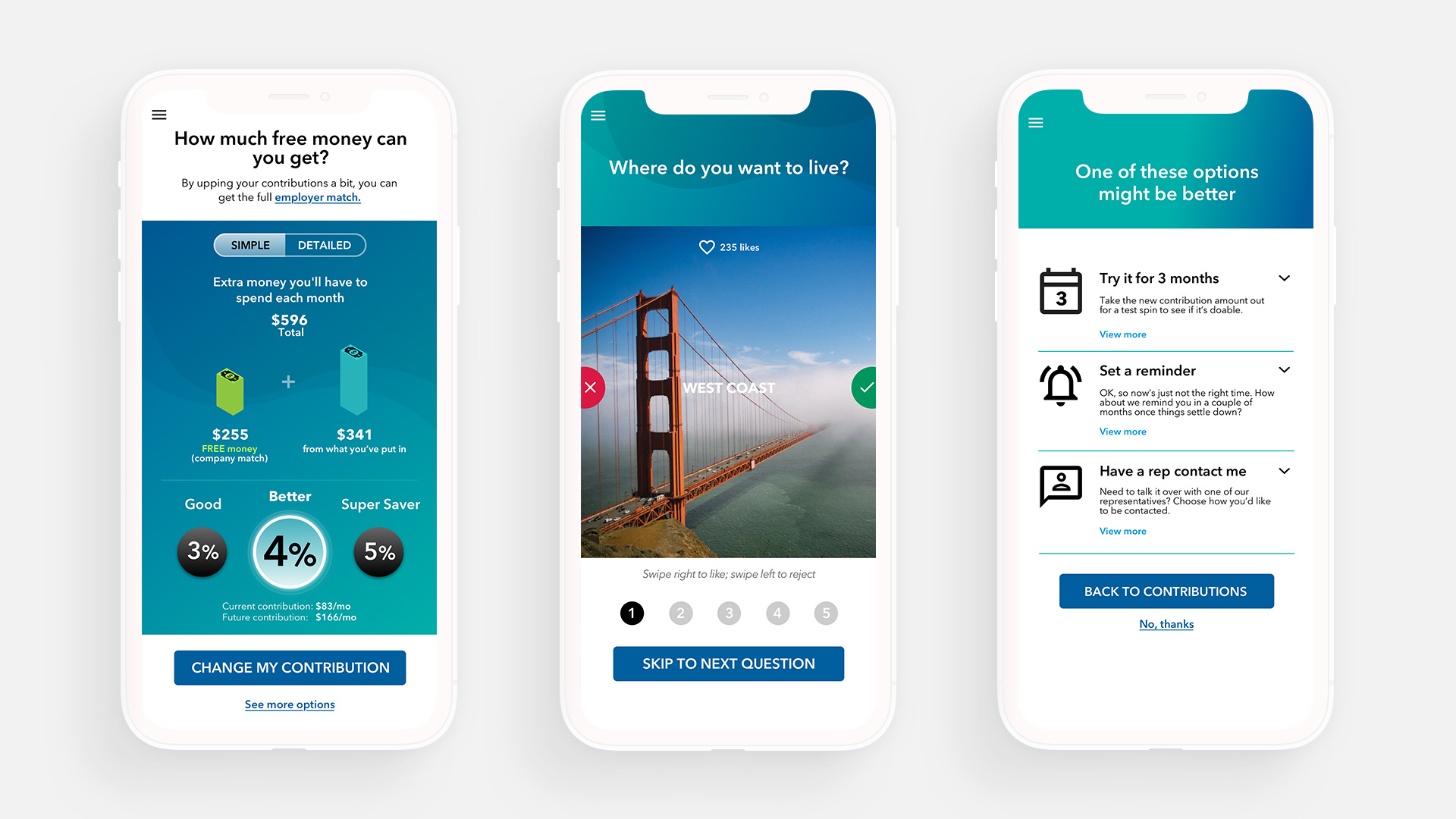
Each journey was broken into three main funnels of user conversion: Engage, Decide, and Act. Thus all experiences should drive towards our main action, which was to increase 401(k) contributions.
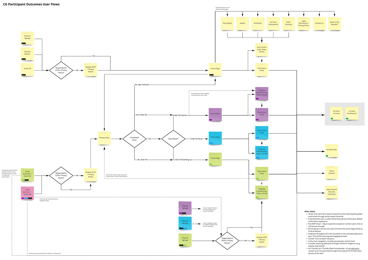
User Flows
We created user flows and more specific task flows to ensure the specifics of each experience were thought through and optimized.
HYPOTHESIS #1
"People like free money. Duh."
Version 1
We did several iterations of concepts until we landed on a formula we thought could work. Early iterations started as one week Google sprints that resulted in a prototype, doing guerrilla testing using Craigslist recruits.
I designed our first solid prototype centered around the idea of free money, that employees were leaving money on the table by not taking advantage of their company match. However, after some testing, we realized that this idea wasn't resonating as much as we thought it would. We hypothesized that both the complexity of company matches, and the psychology of temporal distance (a reward far off in the future), made this feel abstract or intangible, especially amongst younger users.
HYPOTHESIS #2
"Time and experiences are more valuable than money."
Version 2
We went back to the drawing board and centered our new hypothesis around research on millennials, who generally place priority on time and experiences over money (a significant percentage of our user base are around 30-40 years old). I designed and prototyped a concept that centered less on money, and more on how that money buys you "freedom", or in other words, retirement.
After another round of guerilla testing, we found that while the concept seemed to resonate more than our first, the issue of temporal distance seemed to still be in effect. However, the results still seemed promising enough to push forward as a fully funded project.
HYPOTHESIS #3
"Engagement drives action."
Final Designs
We built upon our second hypothesis to reinforce our guiding principle of "engagement drives action". We knew that no matter what research we gathered or whatever gimmicks we used, we would not gain significant behavioral change and action-oriented results (increasing one's 401(k) contributions) unless we can engage our users.
So we set out to focus on the content portion of the experience, to ensure that it had a consistently warm and noncondescending tone and voice. We worked with our content partners Dose to create some fun and slightly off-kilter content to help differentiate us from a sea of sameness of financial wellness sites.
Personalization
We found small opportunities of personalization to help create a welcoming experience.
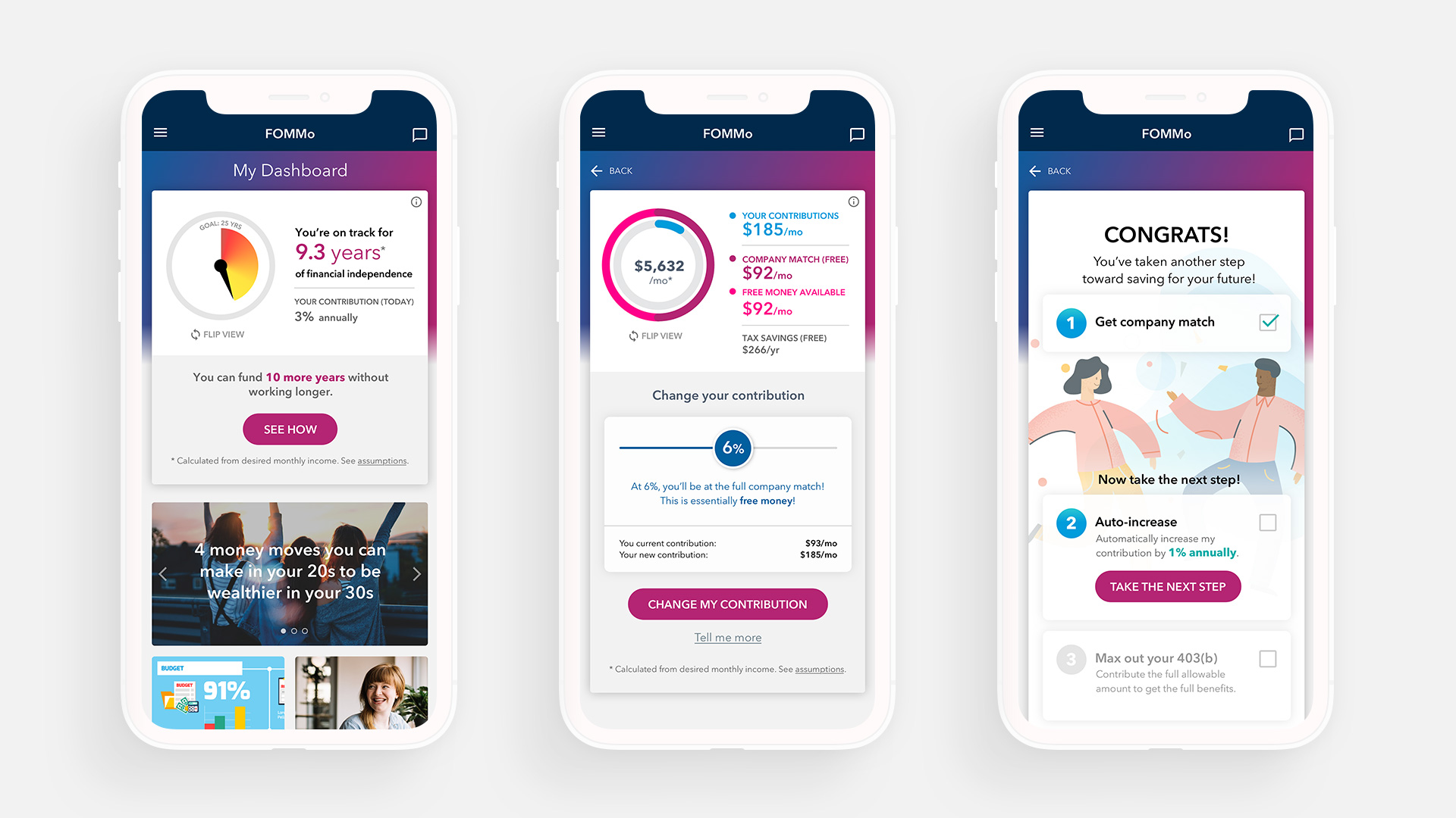
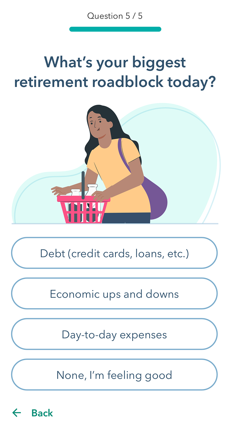
What's your Retirement Personality?
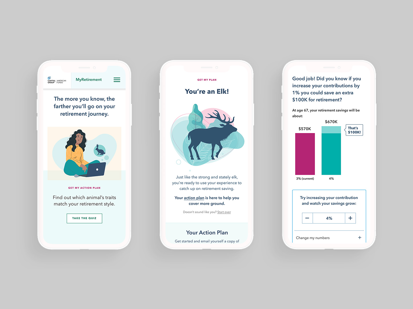
Part of creating an engaging and differentiated experience included some off-center concepts such as a quiz to determine your "Retirement Personality", embodied as an animal. This was a way to spark some viral conversation amongst employees, while also gaining some insight into our users in order to serve up different experiences based on their answers.
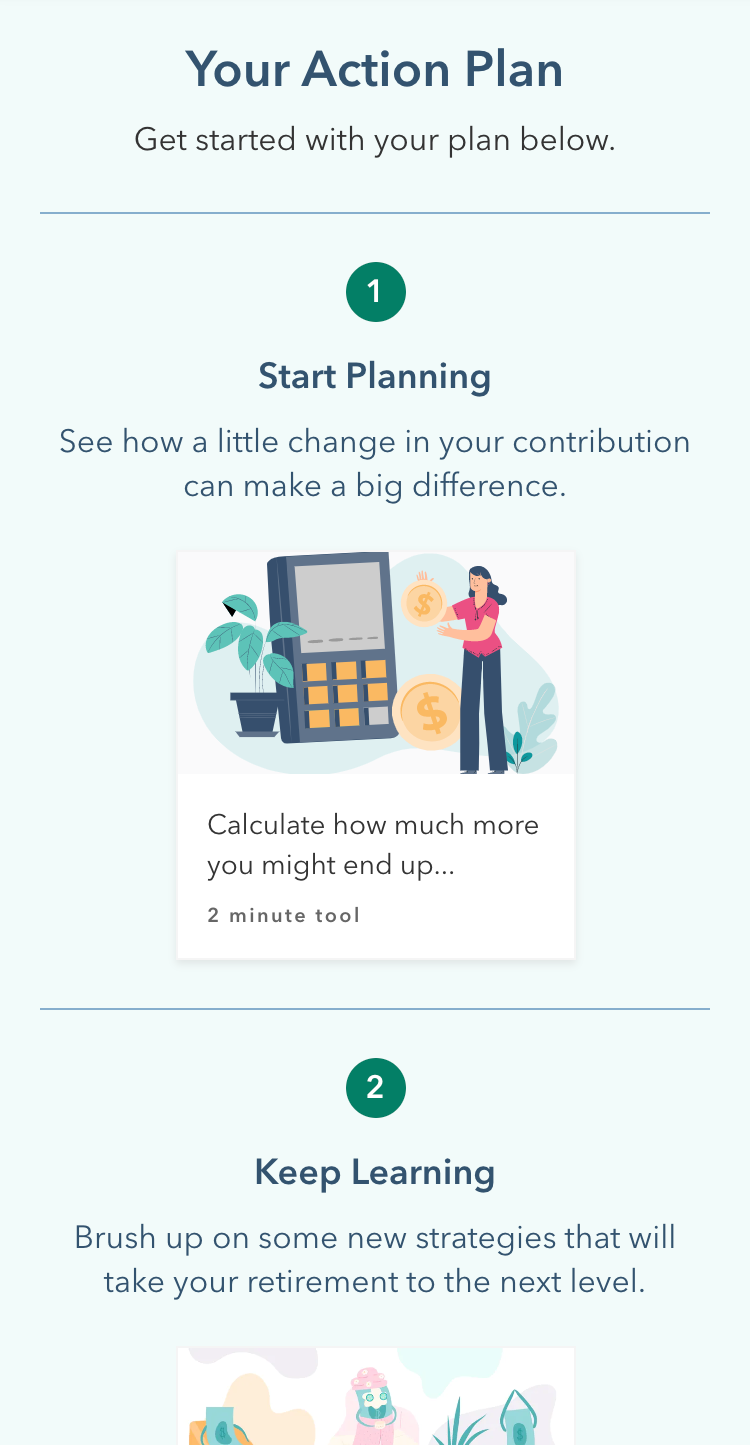
After answering all the questions, the user would get an animal-based retirement personality, complete with an action plan so they have some clear guidance on how to proceed.
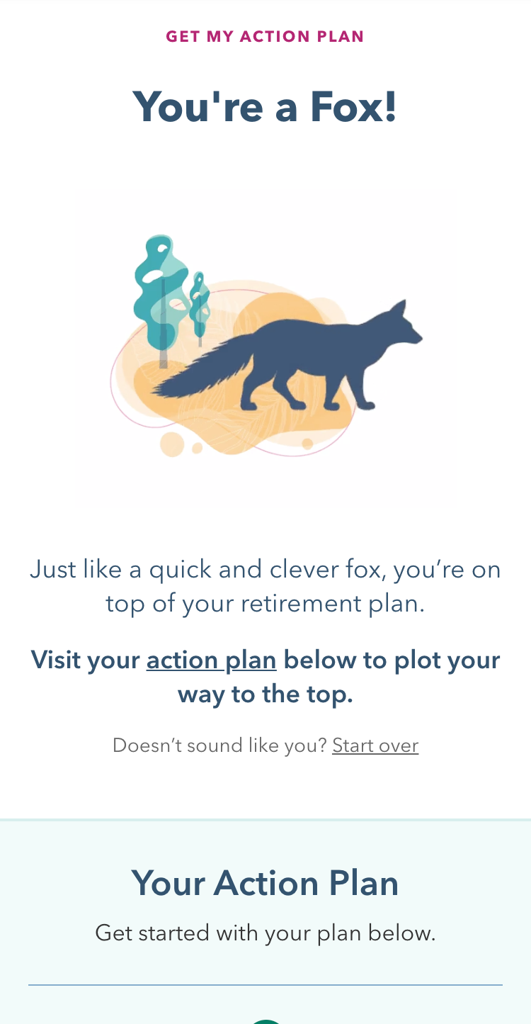
While I created the animal illustrations, it was one of our designers who turned them into these fun animations, which took them to the next level:


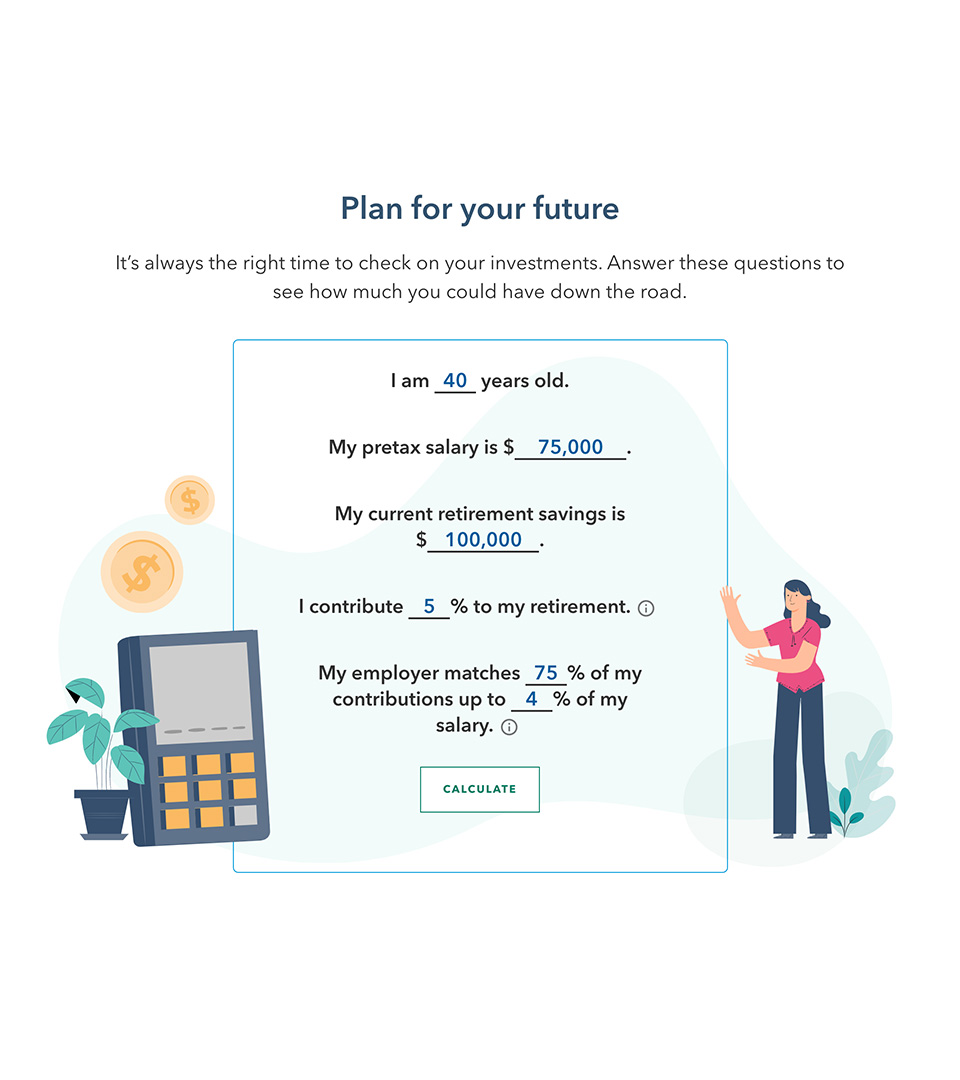
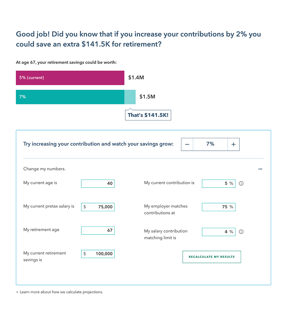
Calculator
During user testing our retirement calculator proved to be the number one indicator of influencing behavior and driving action. Its power was in its powerful message of "a small change makes a big difference". It took several iterations of overly complex interfaces and concepts before we landed on this simpler version.
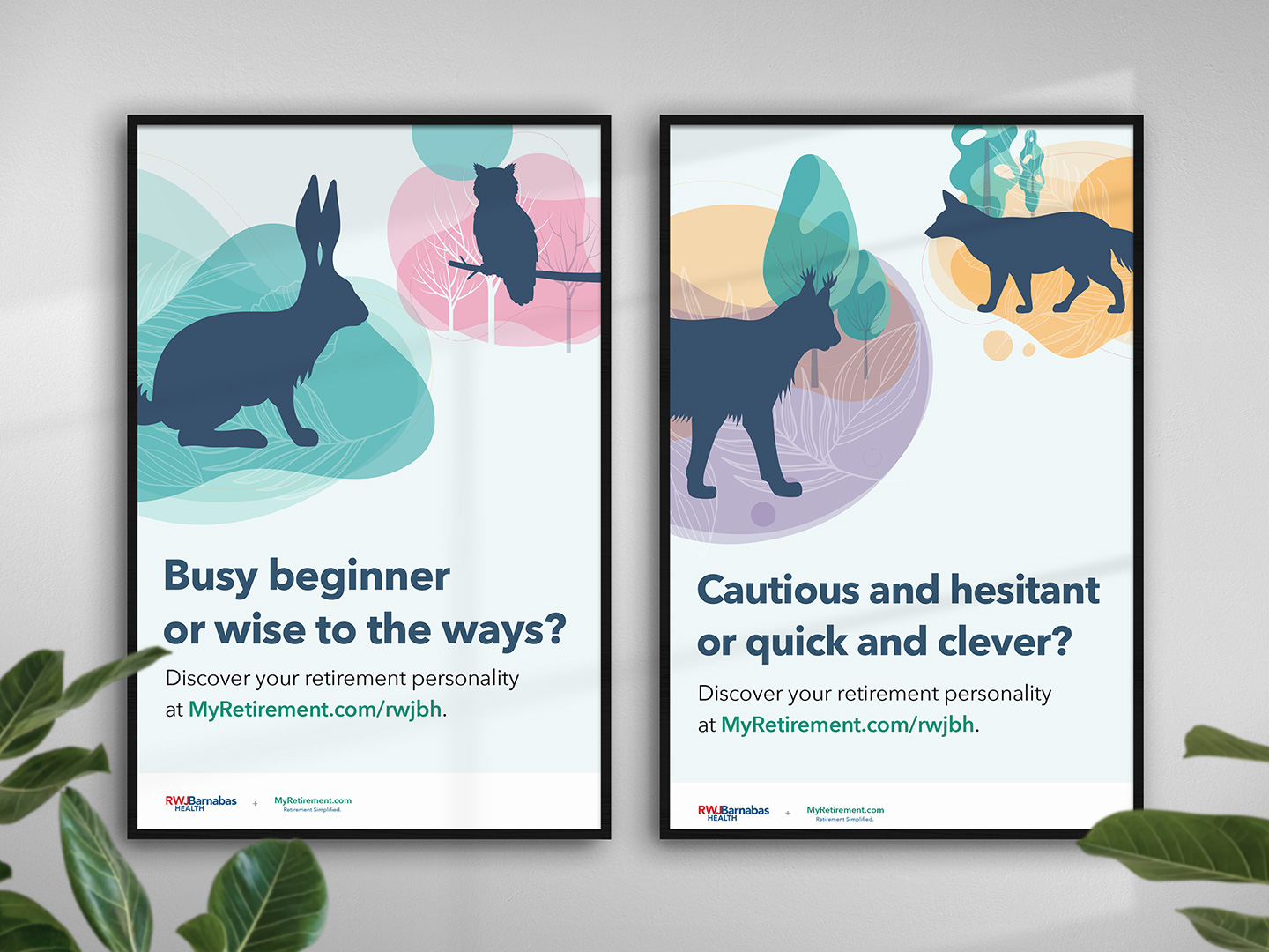
Surround Sound
We knew we couldn't rely on just the digital experience and emails to get the word out. We launched a 360° surround sound campaign including promotional posters that could be displayed at employee break rooms.
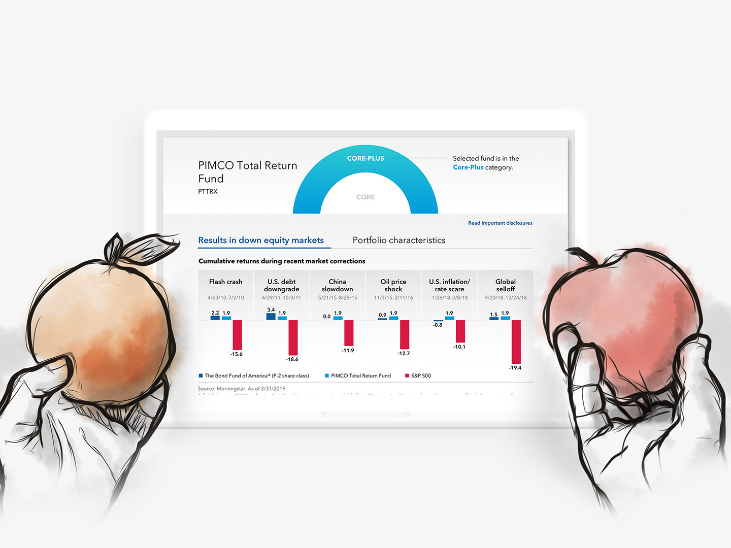
Illustration

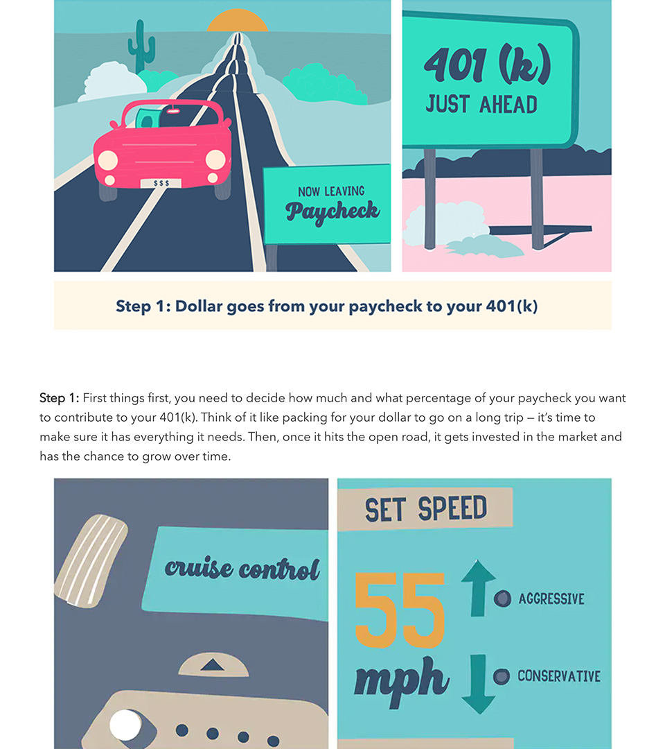
We heavily leveraged illustration over stock photography, as the abstraction of the illustrations helped to make the content feel more approachable and relatable.
Because content was coming from different sources, we also created illustration guidelines to help ensure some consistency, while allowing for some creative flexibility.
Outcomes
The site launched under a pilot with a large client. Early indicators were strong, suggesting a significant impact and initial success. What's more important are the behavioral changes we saw which can positively impact participant's lives.
2x
The rate of contribution
Participants who visited the site increased their contribution at twice the rate of those who did not visit.
56%
More than the starting rate
The average contribution increased 56% more than the starting rate amongst those who made a change.
54%
Increase in number of individuals
The number of individuals who increased their contributions grew by 54% compared with the same period the year prior.